Statistics
This section of the user guide covers the core statistical functions available in math expressions.
Descriptive Statistics
The describe function returns descriptive statistics for a
numeric array. The describe function returns a single tuple with name/value
pairs containing the descriptive statistics.
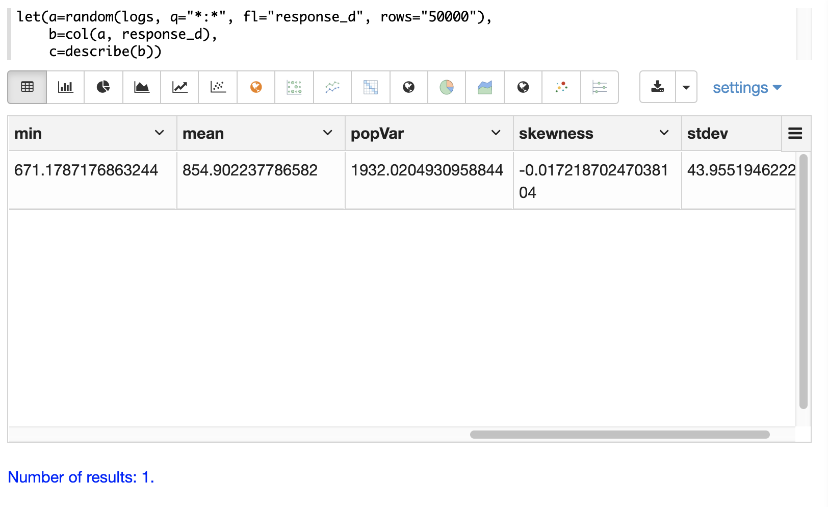
Below is a simple example that selects a random sample of documents from the logs collection,
vectorizes the response_d field in the result set and uses the describe function to
return descriptive statistics about the vector.
let(a=random(logs, q="*:*", fl="response_d", rows="50000"),
    b=col(a, response_d),
    c=describe(b))
When this expression is sent to the /stream handler it responds with:
{
  "result-set": {
    "docs": [
      {
        "sumsq": 36674200601.78738,
        "max": 1068.854686837548,
        "var": 1957.9752647562789,
        "geometricMean": 854.1445499569674,
        "sum": 42764648.83319176,
        "kurtosis": 0.013189848821424377,
        "N": 50000,
        "min": 656.023249311864,
        "mean": 855.2929766638425,
        "popVar": 1957.936105250984,
        "skewness": 0.0014560741802307174,
        "stdev": 44.24901428005237
      },
      {
        "EOF": true,
        "RESPONSE_TIME": 430
      }
    ]
  }
}
Notice that the random sample contains 50,000 records and the response time is only 430 milliseconds. Samples of this size can be used to reliably estimate the statistics for very large underlying data sets with sub-second performance.
The describe function can also be visualized in a table with Zeppelin-Solr:
Histograms and Frequency Tables
Histograms and frequency tables are tools for visualizing the distribution of a random variable.
The hist function creates a histogram designed for usage with continuous data. The
freqTable function creates a frequency table for use with discrete data.
histograms
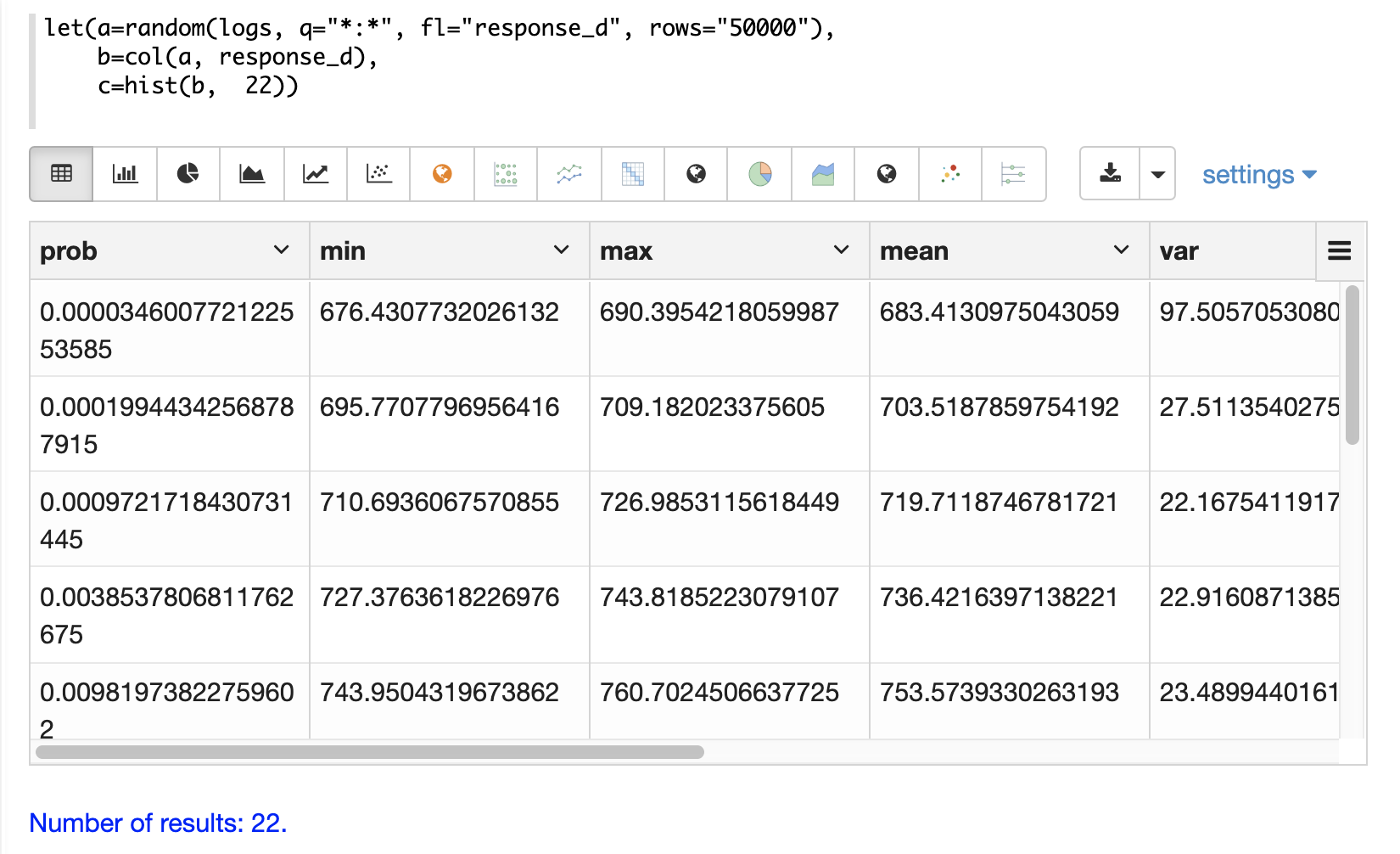
In the example below a histogram is used to visualize a random sample of
response times from the logs collection. The example retrieves the
random sample with the random function and creates a vector from the response_d field
in the result set. Then the hist function is applied to the vector
to return a histogram with 22 bins. The hist function returns a
list of tuples with summary statistics for each bin.
let(a=random(logs, q="*:*", fl="response_d", rows="50000"),
    b=col(a, response_d),
    c=hist(b,  22))
When this expression is sent to the /stream handler it responds with:
{
  "result-set": {
    "docs": [
      {
        "prob": 0.00004896007228311655,
        "min": 675.573084576817,
        "max": 688.3309631697003,
        "mean": 683.805542728906,
        "var": 50.9974629924082,
        "cumProb": 0.000030022417162809913,
        "sum": 2051.416628186718,
        "stdev": 7.141250800273591,
        "N": 3
      },
      {
        "prob": 0.00029607514624062624,
        "min": 696.2875238591652,
        "max": 707.9706315779541,
        "mean": 702.1110569558929,
        "var": 14.136444379466969,
        "cumProb": 0.00022705264963879807,
        "sum": 11233.776911294284,
        "stdev": 3.759846323916307,
        "N": 16
      },
      {
        "prob": 0.0011491235433157194,
        "min": 709.1574910598678,
        "max": 724.9027194369135,
        "mean": 717.8554290699951,
        "var": 20.6935845290122,
        "cumProb": 0.0009858515418689757,
        "sum": 41635.61488605971,
        "stdev": 4.549020172412098,
        "N": 58
      },
      ...
      ]}}
With Zeppelin-Solr the histogram can be first visualized as a table:
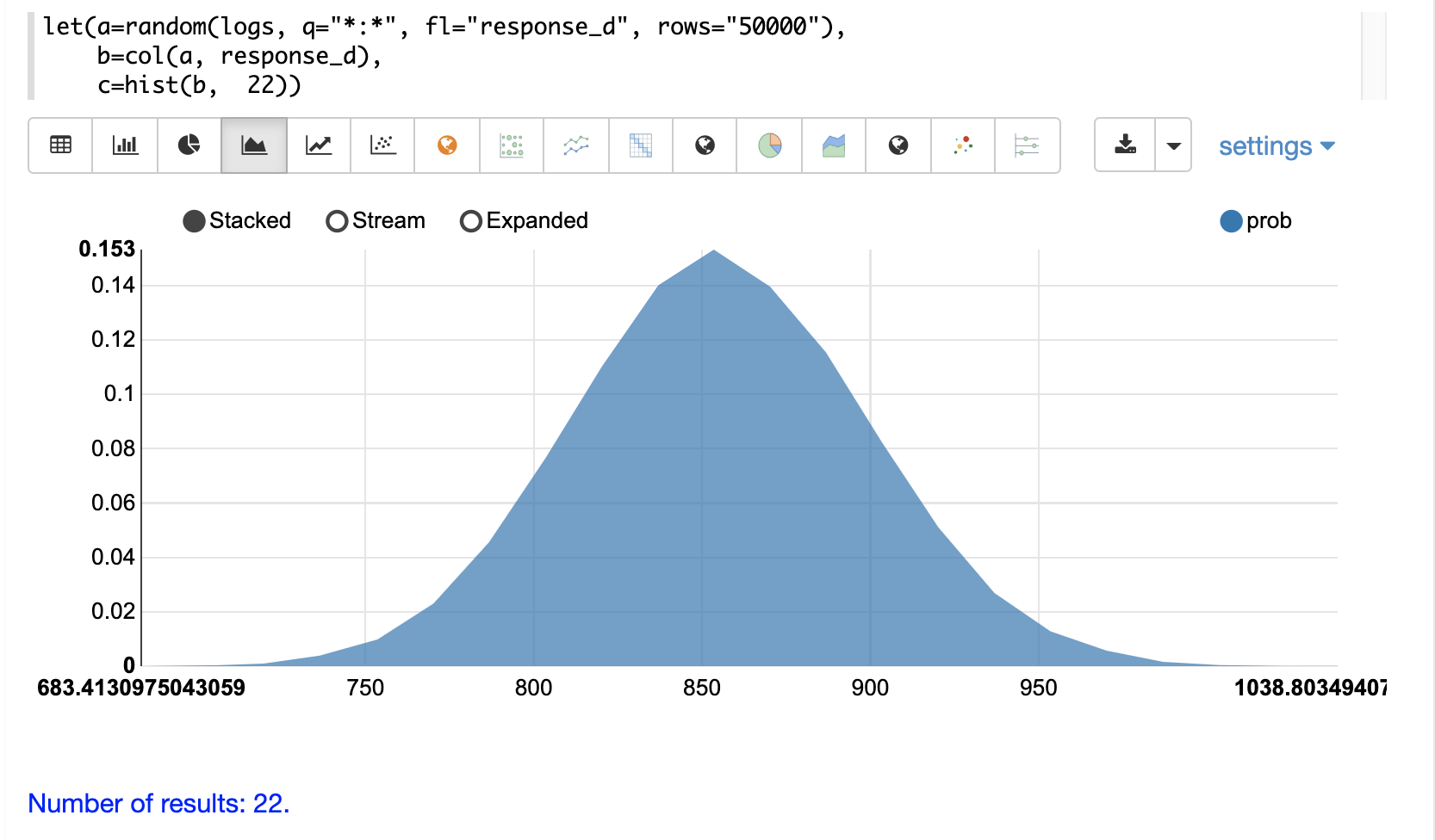
Then the histogram can be visualized with an area chart by plotting the mean of the bins on the x-axis and the prob (probability) on the y-axis:
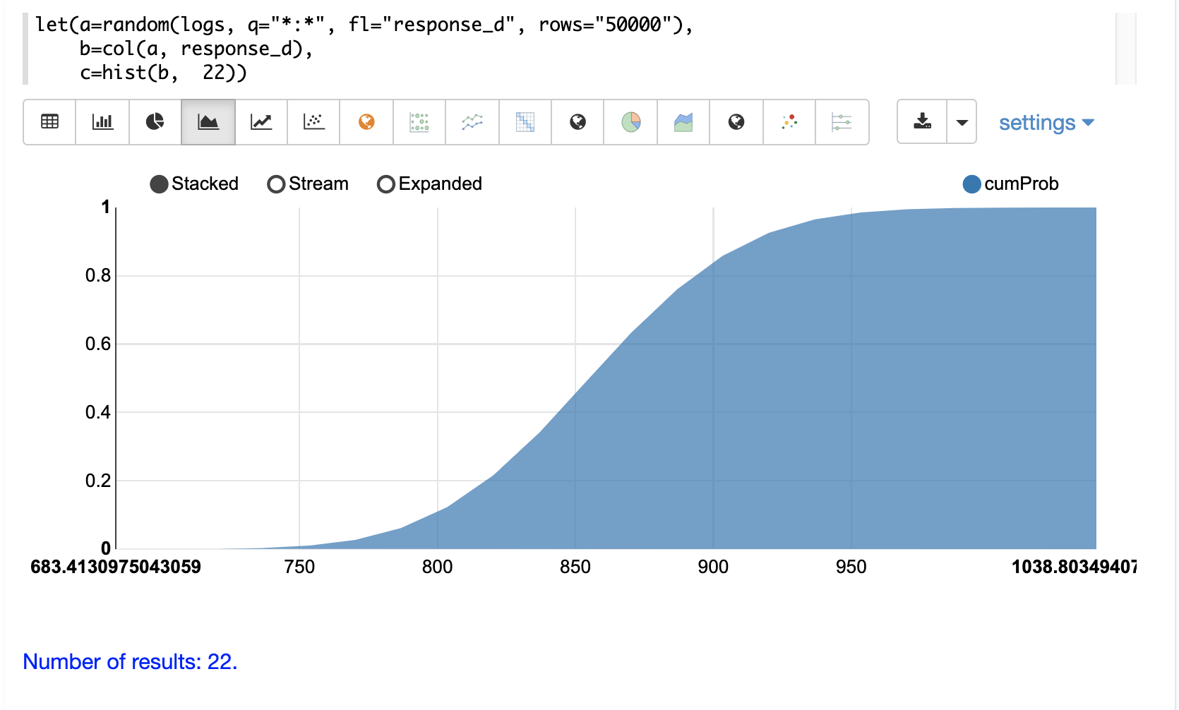
The cumulative probability can be plotted by switching the y-axis to the cumProb column:
Custom Histograms
Custom histograms can be defined and visualized by combining the output from multiple
stats functions into a single histogram. Instead of automatically binning a numeric
field the custom histogram allows for comparison of bins based on queries.
The stats function is first discussed in the Searching, Sampling and Aggregation section of the
user guide.
|
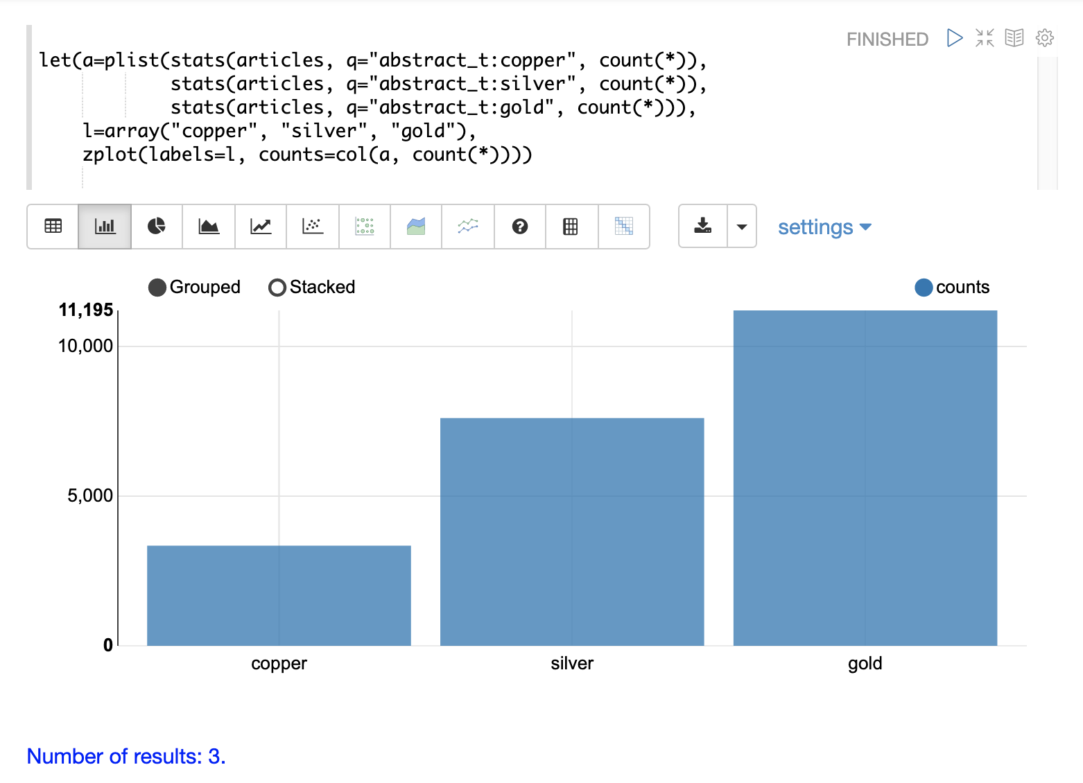
A simple example will illustrate how to define and visualize a custom histogram.
In this example, three stats functions are wrapped in a plist function. The
plist (parallel list) function executes each of its internal functions in parallel
and concatenates the results into a single stream. plist also maintains the order
of the outputs from each of the sub-functions. In this example each stats function
computes the count of documents that match a specific query. In this case they count the
number of documents that contain the terms copper, gold and silver. The list of tuples
with the counts is then stored in variable a.
Then an array of labels is created and set to variable l.
Finally the zplot function is used to plot the labels vector and the count(*) column.
Notice the col function is used inside of the zplot function to extract the
counts from the stats results.
Frequency Tables
The freqTable function returns a frequency distribution for a discrete data set.
The freqTable function doesn’t create bins like the histogram. Instead it counts
the occurrence of each discrete data value and returns a list of tuples with the
frequency statistics for each value.
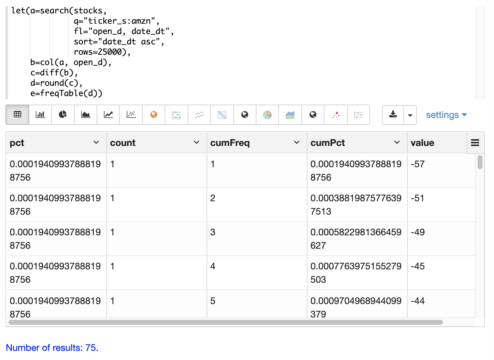
Below is an example of a frequency table built from a result set of rounded differences in daily opening stock prices for the stock ticker amzn.
This example is interesting because it shows a multi-step process to arrive
at the result. The first step is to search for records in the the stocks
collection with a ticker of amzn. Notice that the result set is sorted by
date ascending and it returns the open_d field which is the opening price for
the day.
The open_d field is then vectorized and set to variable b, which now contains
a vector of opening prices ordered by date ascending.
The diff function is then used to calculate the first difference for the
vector of opening prices. The first difference simply subtracts the previous value
from each value in the array. This will provide an array of price differences
for each day which will show daily change in opening price.
Then the round function is used to round the price differences to the nearest
integer to create a vector of discrete values. The round function in this
example is effectively binning continuous data at integer boundaries.
Finally the freqTable function is run on the discrete values to calculate
the frequency table.
let(a=search(stocks,
             q="ticker_s:amzn",
             fl="open_d, date_dt",
             sort="date_dt asc",
             rows=25000),
    b=col(a, open_d),
    c=diff(b),
    d=round(c),
    e=freqTable(d))
When this expression is sent to the /stream handler it responds with:
 {
   "result-set": {
     "docs": [
       {
         "pct": 0.00019409937888198756,
         "count": 1,
         "cumFreq": 1,
         "cumPct": 0.00019409937888198756,
         "value": -57
       },
       {
         "pct": 0.00019409937888198756,
         "count": 1,
         "cumFreq": 2,
         "cumPct": 0.00038819875776397513,
         "value": -51
       },
       {
         "pct": 0.00019409937888198756,
         "count": 1,
         "cumFreq": 3,
         "cumPct": 0.0005822981366459627,
         "value": -49
       },
       ...
       ]}}
With Zeppelin-Solr the frequency table can be first visualized as a table:
The frequency table can then be plotted by switching to a scatter chart and selecting the value column for the x-axis and the count column for the y-axis
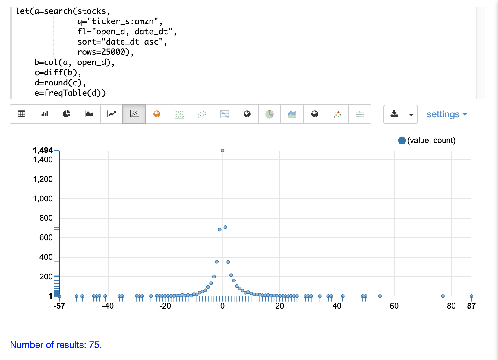
Notice that the visualization nicely displays the frequency of daily change in stock prices rounded to integers. The most frequently occurring value is 0 with 1494 occurrences followed by -1 and 1 with around 700 occurrences.
Percentiles
The percentile function returns the estimated value for a specific percentile in
a sample set. The example below returns a random sample containing the response_d field
from the logs collection. The response_d field is vectorized and the 20th percentile
is calculated for the vector:
let(a=random(logs, q="*:*", rows="15000", fl="response_d"),
    b=col(a, response_d),
    c=percentile(b, 20))
When this expression is sent to the /stream handler it responds with:
 {
   "result-set": {
     "docs": [
       {
         "c": 818.073554
       },
       {
         "EOF": true,
         "RESPONSE_TIME": 286
       }
     ]
   }
 }
The percentile function can also compute an array of percentile values.
The example below is computing the 20th, 40th, 60th and 80th percentiles for a random sample
of the response_d field:
let(a=random(logs, q="*:*", rows="15000", fl="response_d"),
    b=col(a, response_d),
    c=percentile(b, array(20,40,60,80)))
When this expression is sent to the /stream handler it responds with:
{
  "result-set": {
    "docs": [
      {
        "c": [
          818.0835543394625,
          843.5590348165282,
          866.1789509894824,
          892.5033386599067
        ]
      },
      {
        "EOF": true,
        "RESPONSE_TIME": 291
      }
    ]
  }
}
Quantile Plots
Quantile plots or QQ Plots are powerful tools for visually comparing two or more distributions.
A quantile plot, plots the percentiles from two or more distributions in the same visualization. This allows for visual comparison of the distributions at each percentile. A simple example will help illustrate the power of quantile plots.
In this example the distribution of daily stock price changes for two stock tickers, goog and amzn, are visualized with a quantile plot.
The example first creates an array of values representing the percentiles that will be calculated and sets this array
to variable p. Then random samples of the change_d field are drawn for the tickers amzn and goog. The change_d field
represents the change in stock price for one day. Then the change_d field is vectorized for both samples and placed
in the variables amzn and goog. The percentile function is then used to calculate the percentiles for both vectors. Notice that
the variable p is used to specify the list of percentiles that are calculated.
Finally zplot is used to plot the percentiles sequence on the x-axis and the calculated
percentile values for both distributions on the y-axis. And a line plot is used
to visualize the QQ plot.
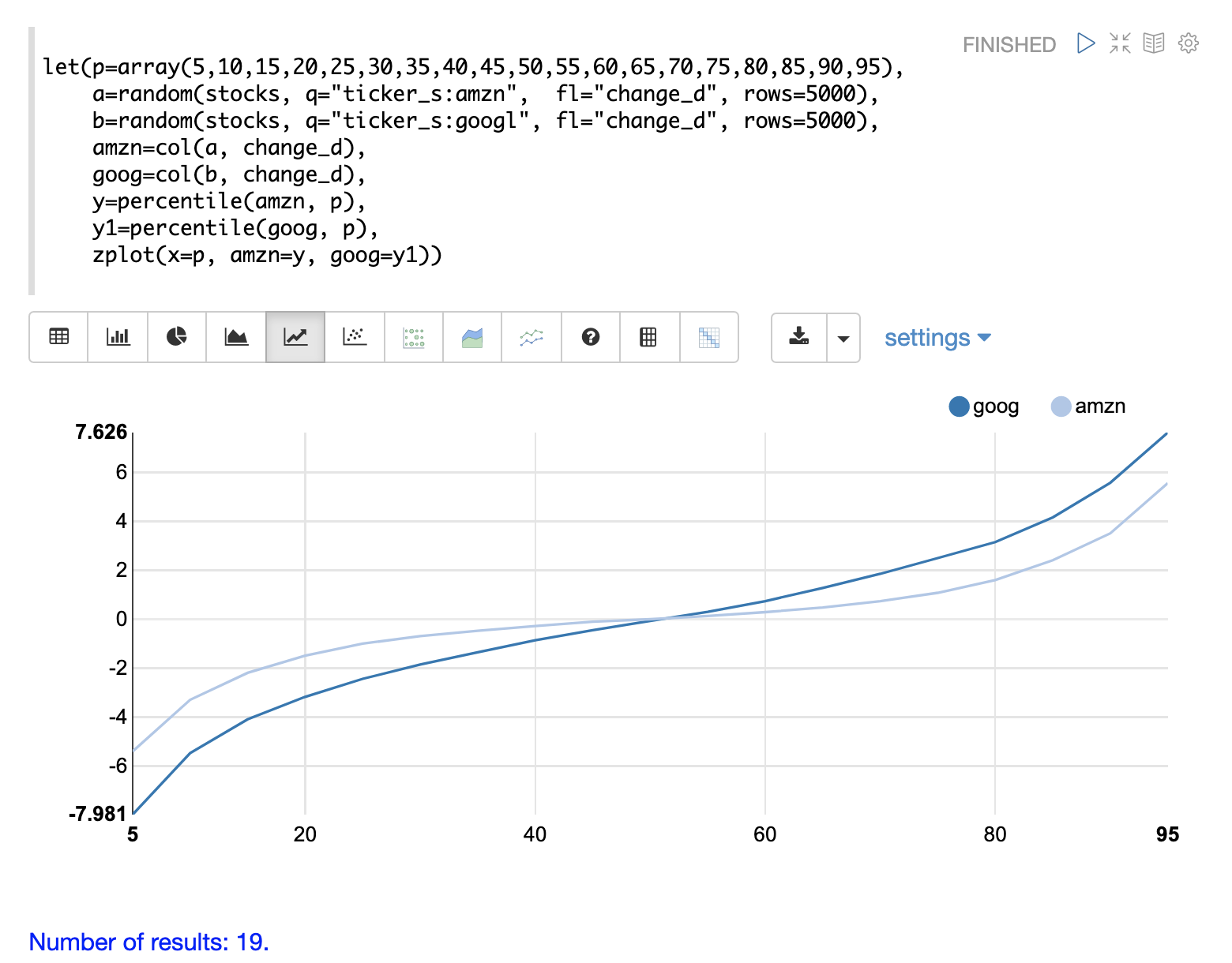
This quantile plot provides a clear picture of the distributions of daily price changes for amzn and googl. In the plot the x-axis is the percentiles and the y-axis is the percentile value calculated.
Notice that the goog percentile value starts lower and ends higher than the amzn plot and that there is a steeper slope. This shows the greater variability in the goog price change distribution. The plot gives a clear picture of the difference in the distributions across the full range of percentiles.
Correlation and Covariance
Correlation and Covariance measure how random variables fluctuate together.
Correlation and Correlation Matrices
Correlation is a measure of the linear correlation between two vectors. Correlation is scaled between -1 and 1.
Three correlation types are supported:
pearsons (default)
kendalls
spearmans
The type of correlation is specified by adding the type named parameter in the function call.
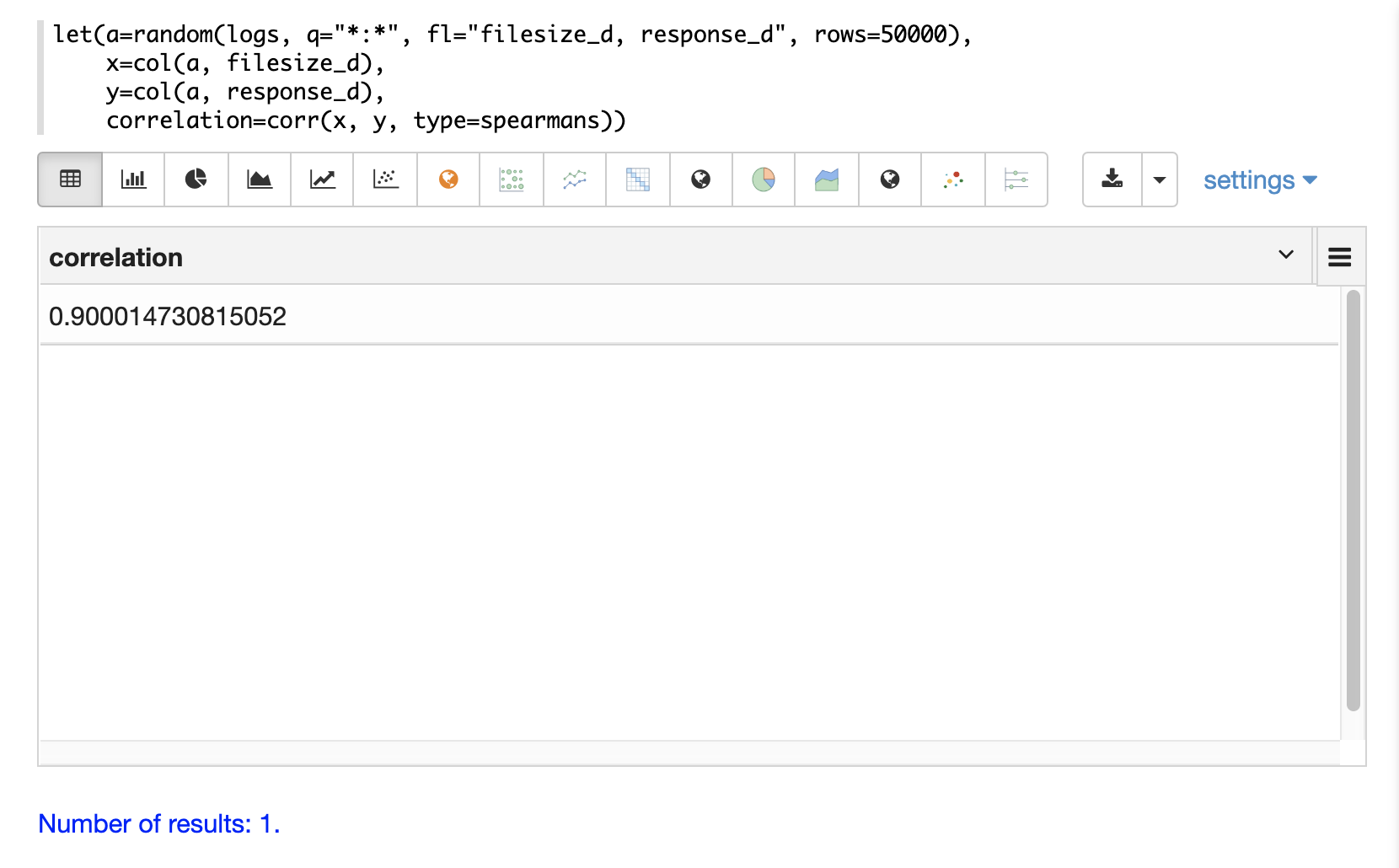
In the example below a random sample containing two fields, filesize_d and response_d, is drawn from
the logs collection using the random function. The fields are vectorized into the
variables x and y and then Spearman’s correlation for
the two vectors is calculated using the corr function.
Correlation Matrices
Correlation matrices are powerful tools for visualizing the correlation between two or more vectors.
The corr function builds a correlation matrix
if a matrix is passed as the parameter. The correlation matrix is computed by correlating the columns
of the matrix.
The example below demonstrates the power of correlation matrices combined with 2 dimensional faceting.
In this example the facet2D function is used to generate a two dimensional facet aggregation
over the fields complaint_type_s and zip_s from the nyc311 complaints database.
The top 20 complaint types and the top 25 zip codes for each complaint type are aggregated.
The result is a stream of tuples each containing the fields complaint_type_s, zip_s and
the count for the pair.
The pivot function is then used to pivot the fields into a matrix with the zip_s
field as the rows and the complaint_type_s field as the columns. The count(*) field populates
the values in the cells of the matrix.
The corr function is then used correlate the columns of the matrix. This produces a correlation matrix
that shows how complaint types are correlated based on the zip codes they appear in. Another way to look at this
is it shows how the different complaint types tend to co-occur across zip codes.
Finally the zplot function is used to plot the correlation matrix as a heat map.
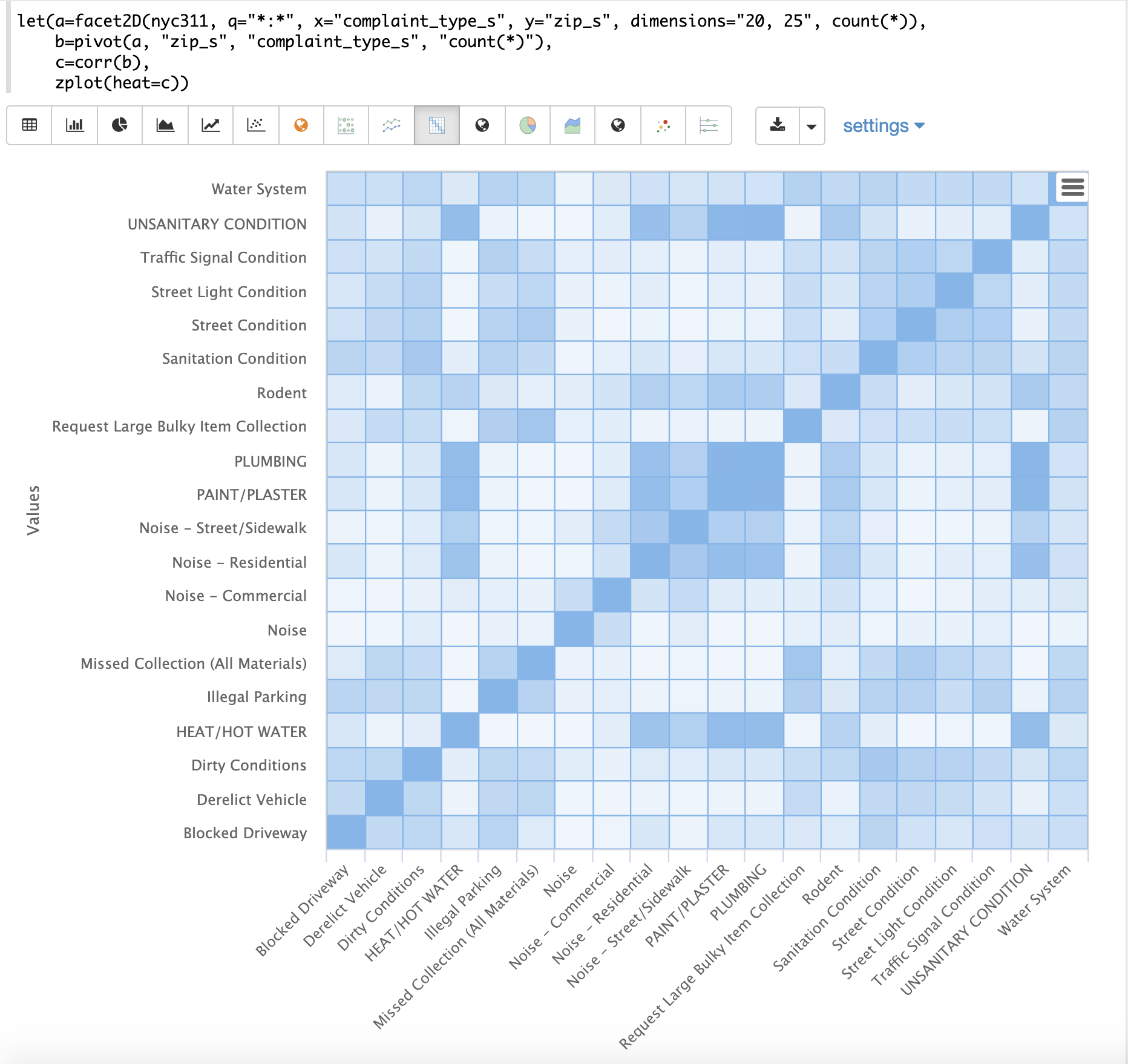
Notice in the example the correlation matrix is square with complaint types shown on both the x and y-axises. The color of the cells in the heat map shows the intensity of the correlation between the complaint types.
The heat map is interactive, so mousing over one of the cells pops up the values for the cell.
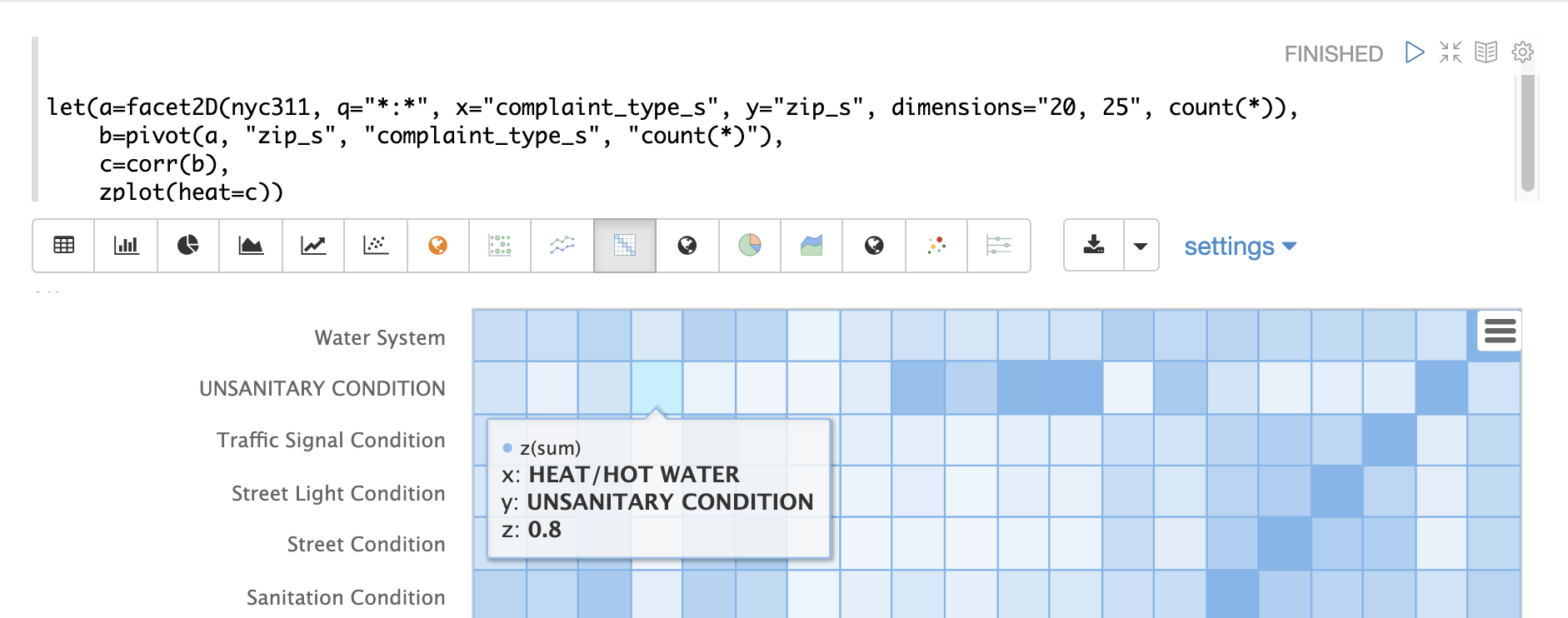
Notice that HEAT/HOT WATER and UNSANITARY CONDITION complaints have a correlation of 8 (rounded to the nearest tenth).
Covariance and Covariance Matrices
Covariance is an unscaled measure of correlation.
The cov function calculates the covariance of two vectors of data.
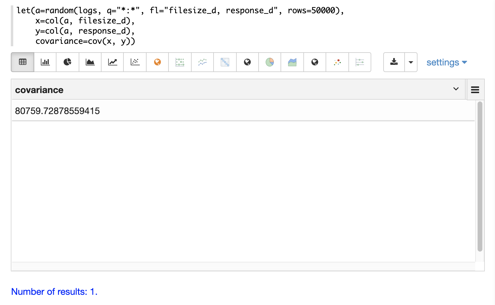
In the example below a random sample containing two fields, filesize_d and response_d, is drawn from
the logs collection using the random function. The fields are vectorized into the
variables x and y and then the covariance for
the two vectors is calculated using the cov function.
If a matrix is passed to the cov function it will automatically compute a covariance
matrix for the columns of the matrix.
Notice in the example below that the x and y vectors are added to a matrix. The matrix is then transposed to turn the rows into columns, and the covariance matrix is computed for the columns of the matrix.
let(a=random(logs, q="*:*", fl="filesize_d, response_d", rows=50000),
    x=col(a, filesize_d),
    y=col(a, response_d),
    m=transpose(matrix(x, y)),
    covariance=cov(m))
When this expression is sent to the /stream handler it responds with:
 {
   "result-set": {
     "docs": [
       {
         "covariance": [
           [
             4018404.072532102,
             80243.3948172242
           ],
           [
             80243.3948172242,
             1948.3216661122592
           ]
         ]
       },
       {
         "EOF": true,
         "RESPONSE_TIME": 534
       }
     ]
   }
 }
The covariance matrix contains both the variance for the two vectors and the covariance between the vectors in the following format:
         x                 y
 x [4018404.072532102, 80243.3948172242],
 y [80243.3948172242,  1948.3216661122592]
The covariance matrix is always square. So a covariance matrix created from 3 vectors will produce a 3 x 3 matrix.
Statistical Inference Tests
Statistical inference tests test a hypothesis on random samples and return p-values which can be used to infer the reliability of the test for the entire population.
The following statistical inference tests are available:
anova: One-Way-Anova tests if there is a statistically significant difference in the means of two or more random samples.ttest: The T-test tests if there is a statistically significant difference in the means of two random samples.pairedTtest: The paired t-test tests if there is a statistically significant difference in the means of two random samples with paired data.gTestDataSet: The G-test tests if two samples of binned discrete data were drawn from the same population.chiSquareDataset: The Chi-Squared test tests if two samples of binned discrete data were drawn from the same population.mannWhitney: The Mann-Whitney test is a non-parametric test that tests if two samples of continuous data were pulled from the same population. The Mann-Whitney test is often used instead of the T-test when the underlying assumptions of the T-test are not met.ks: The Kolmogorov-Smirnov test tests if two samples of continuous data were drawn from the same distribution.
Below is a simple example of a T-test performed on two random samples. The returned p-value of .93 means we can accept the null hypothesis that the two samples do not have statistically significantly differences in the means.
let(a=random(collection1, q="*:*", rows="1500", fl="price_f"),
    b=random(collection1, q="*:*", rows="1500", fl="price_f"),
    c=col(a, price_f),
    d=col(b, price_f),
    e=ttest(c, d))
When this expression is sent to the /stream handler it responds with:
{
  "result-set": {
    "docs": [
      {
        "e": {
          "p-value": 0.9350135639249795,
          "t-statistic": 0.081545541074817
        }
      },
      {
        "EOF": true,
        "RESPONSE_TIME": 48
      }
    ]
  }
}
Transformations
In statistical analysis its often useful to transform data sets before performing statistical calculations. The statistical function library includes the following commonly used transformations:
rank: Returns a numeric array with the rank-transformed value of each element of the original array.log: Returns a numeric array with the natural log of each element of the original array.log10: Returns a numeric array with the base 10 log of each element of the original array.sqrt: Returns a numeric array with the square root of each element of the original array.cbrt: Returns a numeric array with the cube root of each element of the original array.recip: Returns a numeric array with the reciprocal of each element of the original array.
Below is an example of a ttest performed on log transformed data sets:
let(a=random(collection1, q="*:*", rows="1500", fl="price_f"),
    b=random(collection1, q="*:*", rows="1500", fl="price_f"),
    c=log(col(a, price_f)),
    d=log(col(b, price_f)),
    e=ttest(c, d))
When this expression is sent to the /stream handler it responds with:
{
  "result-set": {
    "docs": [
      {
        "e": {
          "p-value": 0.9655110070265056,
          "t-statistic": -0.04324265449471238
        }
      },
      {
        "EOF": true,
        "RESPONSE_TIME": 58
      }
    ]
  }
}
Back Transformations
Vectors that have been transformed with the log, log10, sqrt and cbrt functions
can be back transformed using the pow function.
The example below shows how to back transform data that has been transformed by the
sqrt function.
let(echo="b,c",
    a=array(100, 200, 300),
    b=sqrt(a),
    c=pow(b, 2))
When this expression is sent to the /stream handler it responds with:
{
  "result-set": {
    "docs": [
      {
        "b": [
          10,
          14.142135623730951,
          17.320508075688775
        ],
        "c": [
          100,
          200.00000000000003,
          300.00000000000006
        ]
      },
      {
        "EOF": true,
        "RESPONSE_TIME": 0
      }
    ]
  }
}
The example below shows how to back transform data that has been transformed by the
log10 function.
let(echo="b,c",
    a=array(100, 200, 300),
    b=log10(a),
    c=pow(10, b))
When this expression is sent to the /stream handler it responds with:
{
  "result-set": {
    "docs": [
      {
        "b": [
          2,
          2.3010299956639813,
          2.4771212547196626
        ],
        "c": [
          100,
          200.00000000000003,
          300.0000000000001
        ]
      },
      {
        "EOF": true,
        "RESPONSE_TIME": 0
      }
    ]
  }
}
Vectors that have been transformed with the recip function can be back-transformed by taking the reciprocal
of the reciprocal.
The example below shows an example of the back-transformation of the recip function.
let(echo="b,c",
    a=array(100, 200, 300),
    b=recip(a),
    c=recip(b))
When this expression is sent to the /stream handler it responds with:
{
  "result-set": {
    "docs": [
      {
        "b": [
          0.01,
          0.005,
          0.0033333333333333335
        ],
        "c": [
          100,
          200,
          300
        ]
      },
      {
        "EOF": true,
        "RESPONSE_TIME": 0
      }
    ]
  }
}
Z-scores
The zscores function converts a numeric array to an array of z-scores. The z-score
is the number of standard deviations a number is from the mean.
The example below computes the z-scores for the values in an array.
let(a=array(1,2,3),
    b=zscores(a))
When this expression is sent to the /stream handler it responds with:
{
  "result-set": {
    "docs": [
      {
        "b": [
          -1,
          0,
          1
        ]
      },
      {
        "EOF": true,
        "RESPONSE_TIME": 27
      }
    ]
  }
}