Machine Learning
This section of the math expressions user guide covers machine learning functions.
Distance and Distance Matrices
The distance function computes the distance for two numeric arrays or a distance matrix for the columns of a matrix.
There are six distance measure functions that return a function that performs the actual distance calculation:
euclidean(default)manhattancanberraearthMoverscosinehaversineMeters(Geospatial distance measure)
The distance measure functions can be used with all machine learning functions that support distance measures.
Below is an example for computing Euclidean distance for two numeric arrays:
let(a=array(20, 30, 40, 50),
    b=array(21, 29, 41, 49),
    c=distance(a, b))
When this expression is sent to the /stream handler it responds with:
{
  "result-set": {
    "docs": [
      {
        "c": 2
      },
      {
        "EOF": true,
        "RESPONSE_TIME": 0
      }
    ]
  }
}
Below the distance is calculated using Manhattan distance.
let(a=array(20, 30, 40, 50),
    b=array(21, 29, 41, 49),
    c=distance(a, b, manhattan()))
When this expression is sent to the /stream handler it responds with:
{
  "result-set": {
    "docs": [
      {
        "c": 4
      },
      {
        "EOF": true,
        "RESPONSE_TIME": 1
      }
    ]
  }
}
Distance Matrices
Distance matrices are powerful tools for visualizing the distance between two or more vectors.
The distance function builds a distance matrix
if a matrix is passed as the parameter. The distance matrix is computed for the columns
of the matrix.
The example below demonstrates the power of distance matrices combined with 2 dimensional faceting.
In this example the facet2D function is used to generate a two dimensional facet aggregation
over the fields complaint_type_s and zip_s from the nyc311 complaints database.
The top 20 complaint types and the top 25 zip codes for each complaint type are aggregated.
The result is a stream of tuples each containing the fields complaint_type_s, zip_s and the count for the pair.
The pivot function is then used to pivot the fields into a matrix with the zip_s
field as the rows and the complaint_type_s field as the columns. The count(*) field populates
the values in the cells of the matrix.
The distance function is then used to compute the distance matrix for the columns
of the matrix using cosine distance. This produces a distance matrix
that shows distance between complaint types based on the zip codes they appear in.
Finally the zplot function is used to plot the distance matrix as a heat map. Notice that the
heat map has been configured so that the intensity of color increases as the distance between vectors
decreases.
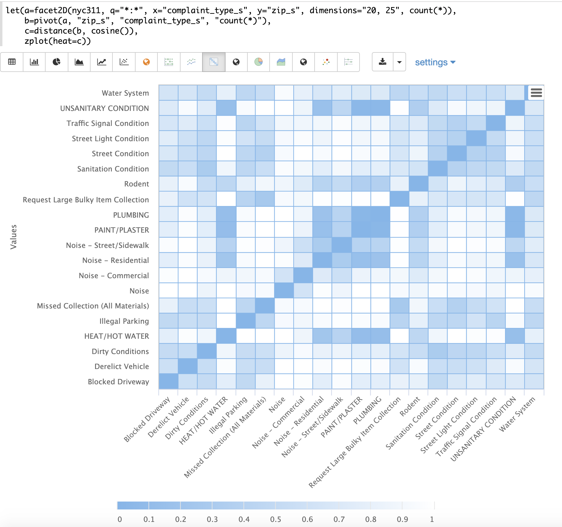
The heat map is interactive, so mousing over one of the cells pops up the values for the cell.
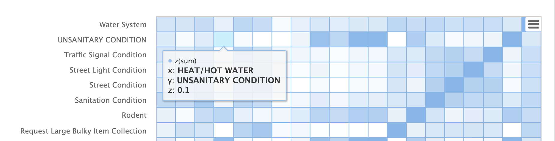
Notice that HEAT/HOT WATER and UNSANITARY CONDITION complaints have a cosine distance of .1 (rounded to the nearest tenth).
K-Nearest Neighbor (KNN)
The knn function searches the rows of a matrix with a search vector and
returns a matrix of the k-nearest neighbors. This allows for secondary vector
searches over result sets.
The knn function supports changing of the distance measure by providing one of the following
distance measure functions:
euclidean(Default)manhattancanberraearthMoverscosinehaversineMeters(Geospatial distance measure)
The example below shows how to perform a secondary search over an aggregation result set. The goal of the example is to find zip codes in the nyc311 complaint database that have similar complaint types to the zip code 10280.
The first step in the example is to use the facet2D function to perform a two
dimensional aggregation over the zip_s and complaint_type_s fields. In the example
the top 119 zip codes and top 5 complaint types for each zip code are calculated
for the borough of Manhattan. The result is a list of tuples each containing
the zip_s, complaint_type_s and the count(*) for the combination.
The list of tuples is then pivoted into a matrix with the pivot function.
The pivot function in this example returns a matrix with rows of zip codes
and columns of complaint types.
The count(*) field from the tuples populates the cells of the matrix.
This matrix will be used as the secondary search matrix.
The next step is to locate the vector for the 10280 zip code.
This is done in three steps in the example.
The first step is to retrieve the row labels from the matrix with the getRowLabels function.
The row labels in this case are zip codes which were populated by the pivot function.
Then the indexOf function is used to find the index of the "10280" zip code in the list of row labels.
The rowAt function is then used to return the vector at that index from the matrix.
This vector is the search vector.
Now that we have a matrix and search vector we can use the knn function to perform the search.
In the example the knn function searches the matrix with the search vector with a K of 5, using
cosine distance. Cosine distance is useful for comparing sparse vectors which is the case in this
example. The knn function returns a matrix with the top 5 nearest neighbors to the search vector.
The knn function populates the row and column labels of the return matrix and
also adds a vector of distances for each row as an attribute to the matrix.
In the example the zplot function extracts the row labels and
the distance vector with the getRowLabels and getAttribute functions.
The topFeatures function is used to extract
the top 5 column labels for each zip code vector, based on the counts for each
column. Then zplot outputs the data in a format that can be visualized in
a table with Zeppelin-Solr.
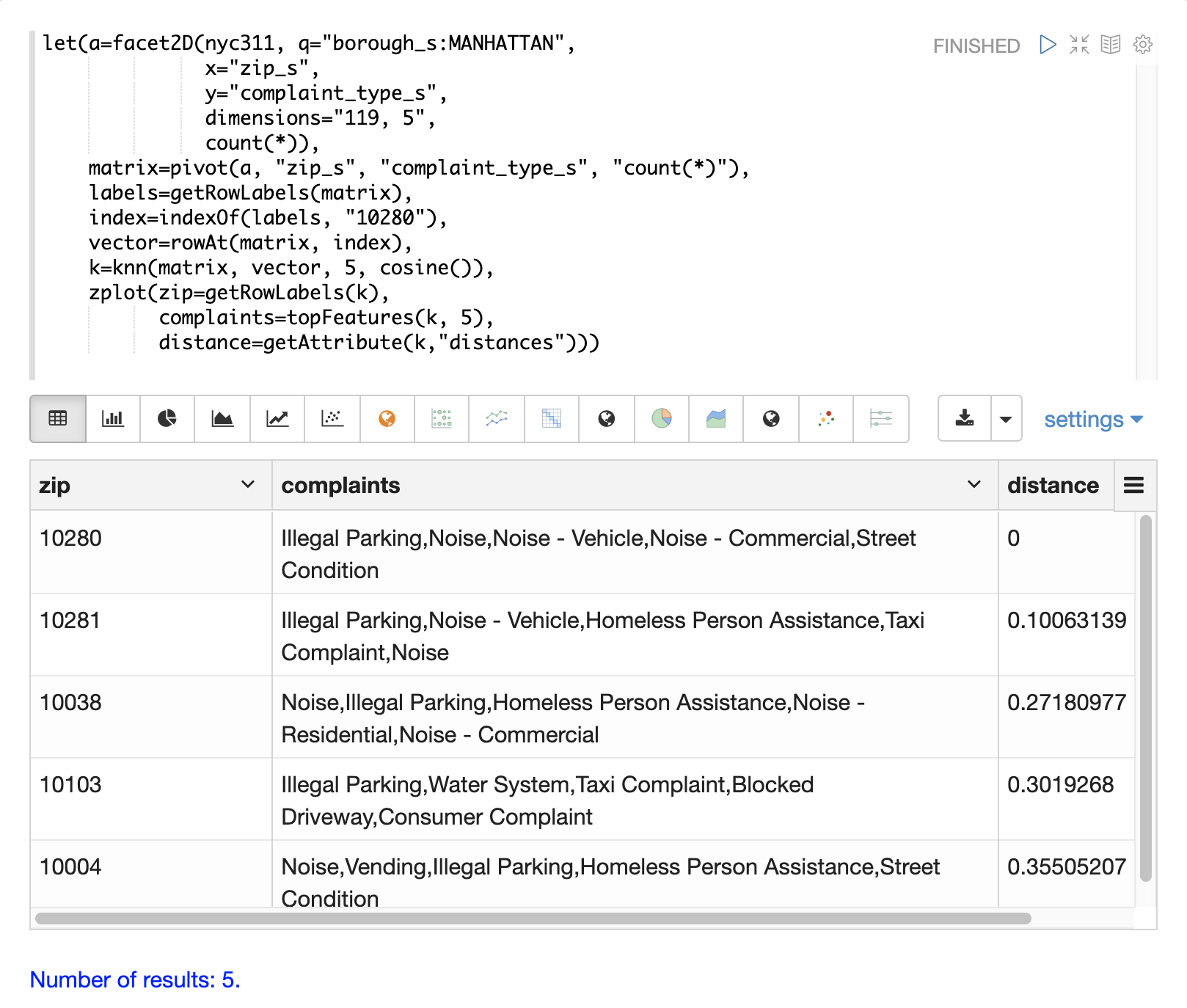
The table above shows each zip code returned by the knn function along
with the list of complaints and distances. These are the zip codes that are most similar
to the 10280 zip code based on their top 5 complaint types.
K-Nearest Neighbor Regression
K-nearest neighbor regression is a non-linear, bivariate and multivariate regression method. KNN regression is a lazy learning technique which means it does not fit a model to the training set in advance. Instead the entire training set of observations and outcomes are held in memory and predictions are made by averaging the outcomes of the k-nearest neighbors.
The knnRegress function is used to perform nearest neighbor regression.
2D Non-Linear Regression
The example below shows the regression plot for KNN regression applied to a 2D scatter plot.
In this example the random function is used to draw 500 random samples from the logs collection
containing two fields filesize_d and eresponse_d. The sample is then vectorized with the
filesize_d field stored in a vector assigned to variable x and the eresponse_d vector stored in
variable y. The knnRegress function is then applied with 20 as the nearest neighbor parameter,
which returns a KNN function which can be used to predict values.
The predict function is then called on the KNN function to predict values for the original x vector.
Finally zplot is used to plot the original x and y vectors along with the predictions.
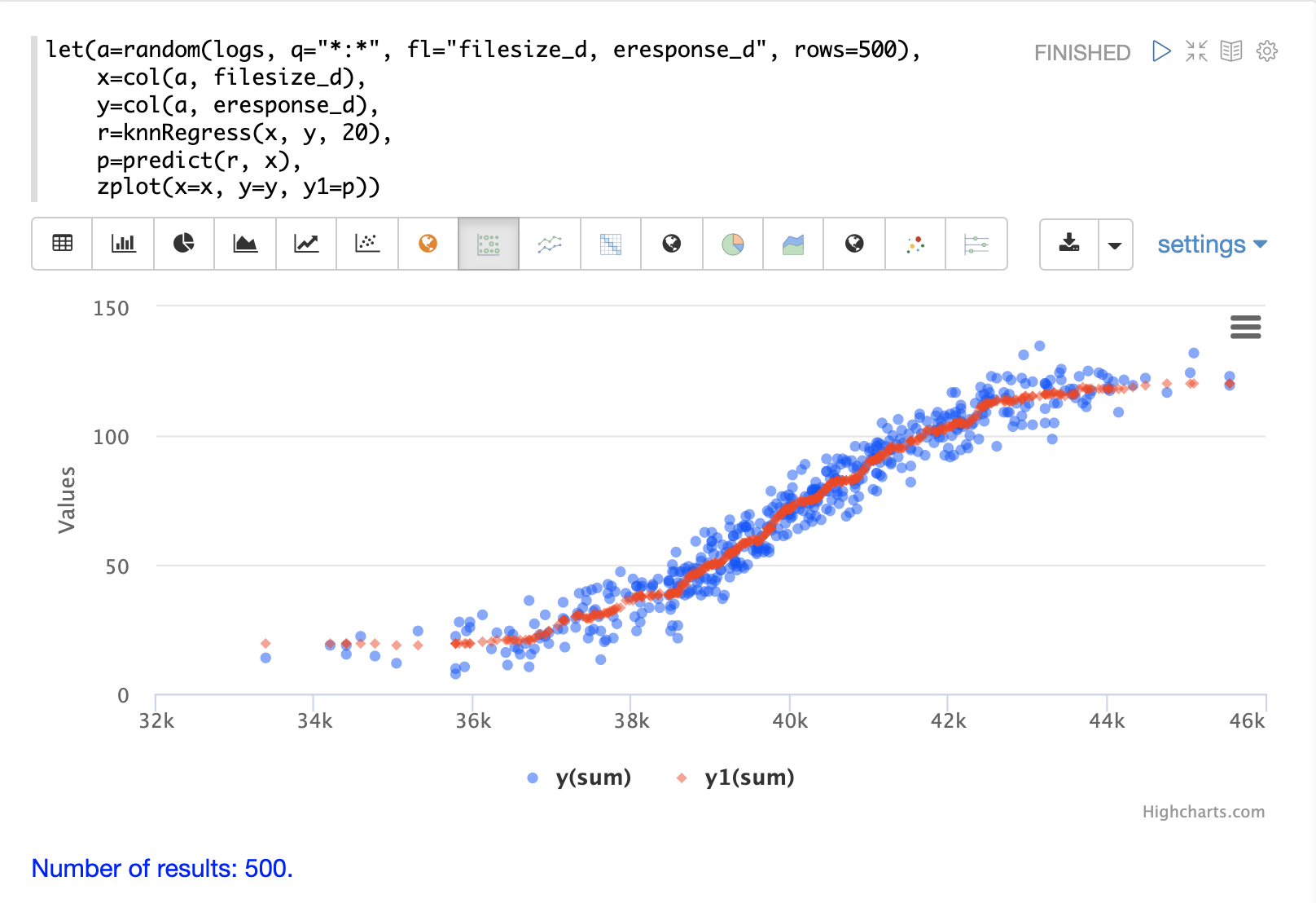
Notice that the regression plot shows a non-linear relations ship between the filesize_d
field and the eresponse_d field. Also note that KNN regression
plots a non-linear curve through the scatter plot. The larger the size
of K (nearest neighbors), the smoother the line.
Multivariate Non-Linear Regression
The knnRegress function is also a powerful and flexible tool for
multi-variate non-linear regression.
In the example below a multi-variate regression is performed using a database designed for analyzing and predicting wine quality. The database contains nearly 1600 records with 9 predictors of wine quality: pH, alcohol, fixed_acidity, sulphates, density, free_sulfur_dioxide, volatile_acidity, citric_acid, residual_sugar. There is also a field called quality assigned to each wine ranging from 3 to 8.
KNN regression can be used to predict wine quality for vectors containing the predictor values.
In the example a search is performed on the redwine collection to
return all the rows in the database of observations. Then the quality field and
predictor fields are read into vectors and set to variables.
The predictor variables are added as rows to a matrix which is
transposed so each row in the matrix contains one observation with the 9
predictor values.
This is our observation matrix which is assigned to the variable obs.
Then the knnRegress function regresses the observations with quality outcomes.
The value for K is set to 5 in the example, so the average quality of the 5
nearest neighbors will be used to calculate the quality.
The predict function is then used to generate a vector of predictions
for the entire observation set. These predictions will be used to determine
how well the KNN regression performed over the observation data.
The error, or residuals, for the regression are then calculated by
subtracting the predicted quality from the observed quality.
The ebeSubtract function is used to perform the element-by-element
subtraction between the two vectors.
Finally the zplot function formats the predictions and errors for
for the visualization of the residual plot.
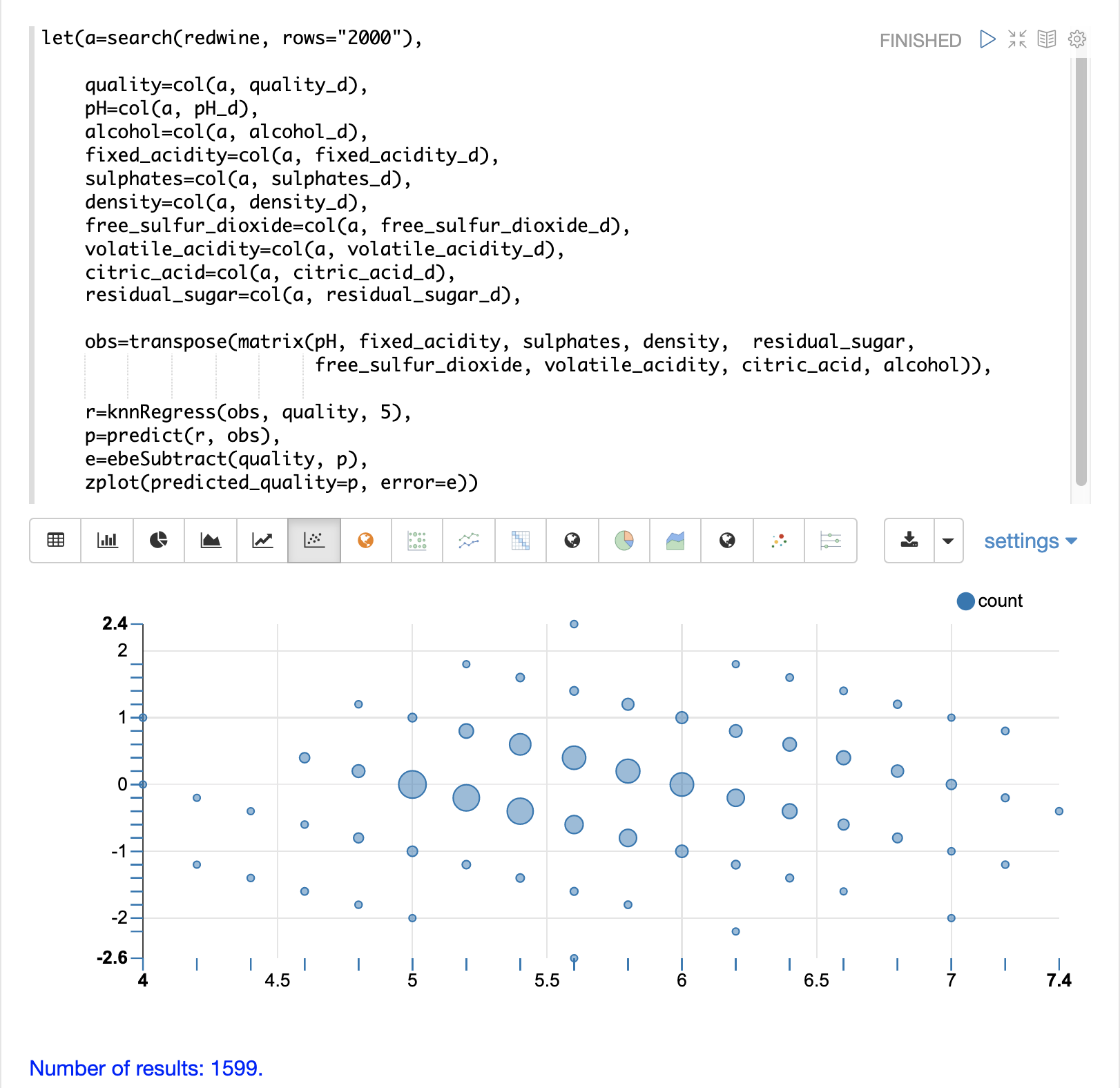
The residual plot plots the predicted values on the x-axis and the error for the prediction on the y-axis. The scatter plot shows how the errors are distributed across the full range of predictions.
The residual plot can be interpreted to understand how the KNN regression performed on the training data.
The plot shows the prediction error appears to be fairly evenly distributed above and below zero. The density of the errors increases as it approaches zero. The bubble size reflects the density of errors at the specific point in the plot. This provides an intuitive feel for the distribution of the model’s error.
The plot also visualizes the variance of the error across the range of predictions. This provides an intuitive understanding of whether the KNN predictions will have similar error variance across the full range predictions.
The residuals can also be visualized using a histogram to better understand the shape of the residuals distribution. The example below shows the same KNN regression as above with a plot of the distribution of the errors.
In the example the zplot function is used to plot the empiricalDistribution
function of the residuals, with an 11 bin histogram.
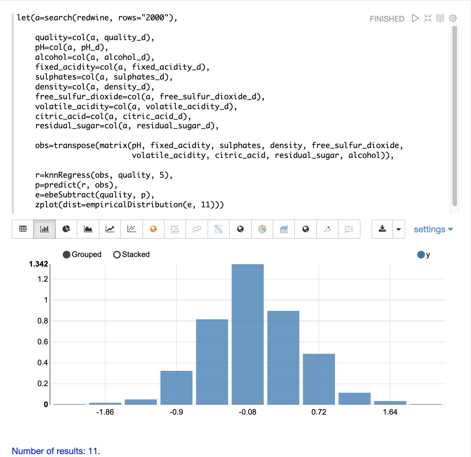
Notice that the errors follow a bell curve centered close to 0. From this plot we can see the probability of getting prediction errors between -1 and 1 is quite high.
Additional KNN Regression Parameters
The knnRegression function has three additional parameters that make it suitable for many different regression scenarios.
Any of the distance measures can be used for the regression simply by adding the function to the call. This allows for regression analysis over sparse vectors (
cosine), dense vectors and geo-spatial lat/lon vectors (haversineMeters).Sample syntax:
r=knnRegress(obs, quality, 5, cosine()),The
robustnamed parameter can be used to perform a regression analysis that is robust to outliers in the outcomes. When therobustparameter is used the median outcome of the k-nearest neighbors is used rather than the average.Sample syntax:
r=knnRegress(obs, quality, 5, robust="true"),The
scalenamed parameter can be used to scale the columns of the observations and search vectors at prediction time. This can improve the performance of the KNN regression when the feature columns are at different scales causing the distance calculations to be place too much weight on the larger columns.Sample syntax:
r=knnRegress(obs, quality, 5, scale="true"),
knnSearch
The knnSearch function returns the k-nearest neighbors
for a document based on text similarity.
Under the covers the knnSearch function uses Solr’s More Like This query parser plugin.
This capability uses the search engine’s query, term statistics, scoring, and ranking capability to perform a fast, nearest neighbor search for similar documents over large distributed indexes.
The results of this search can be used directly or provide candidates for machine learning operations such as a secondary KNN vector search.
The example below shows the knnSearch function on a movie reviews data set. The search returns the 50 documents most similar to a specific document ID (83e9b5b0…) based on the similarity of the review_t field.
The mindf and maxdf specify the minimum and maximum document frequency of the terms used to perform the search.
These parameters can make the query faster by eliminating high frequency terms and also improves accuracy by removing noise terms from the search.
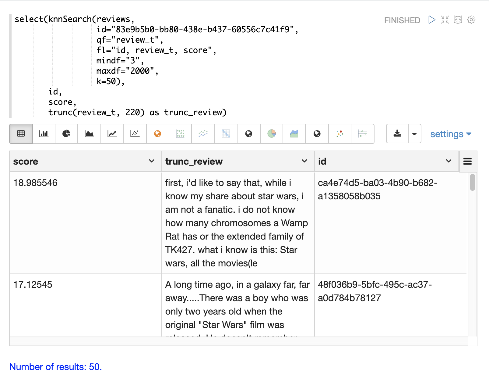
In this example the select
function is used to truncate the review in the output to 220 characters to make it easier
to read in a table.
|
DBSCAN
DBSCAN clustering is a powerful density-based clustering algorithm which is particularly well suited for geospatial clustering. DBSCAN uses two parameters to filter result sets to clusters of specific density:
eps(Epsilon): Defines the distance between points to be considered as neighborsminpoints: The minimum number of points needed in a cluster for it to be returned.
2D Cluster Visualization
The zplot function has direct support for plotting 2D clusters by using the clusters named parameter.
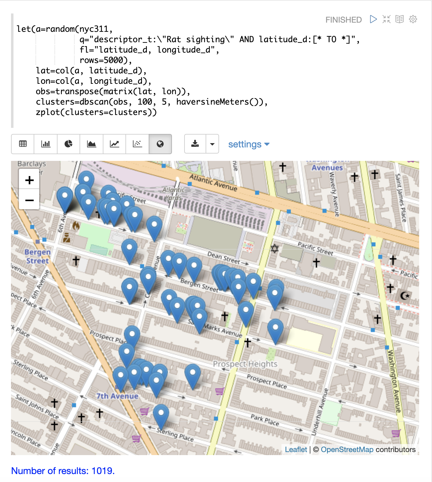
The example below uses DBSCAN clustering and cluster visualization to find the hot spots on a map for rat sightings in the NYC 311 complaints database.
In this example the random function draws a sample of records from the nyc311 collection where
the complaint description matches "rat sighting" and latitude is populated in the record.
The latitude and longitude fields are then vectorized and added as rows to a matrix.
The matrix is transposed so each row contains a single latitude, longitude
point.
The dbscan function is then used to cluster the latitude and longitude points.
Notice that the dbscan function in the example has four parameters.
obs: The observation matrix of lat/lon pointseps: The distance between points to be considered a cluster. 100 meters in the example.min points: The minimum points in a cluster for the cluster to be returned by the function.5in the example.distance measure: An optional distance measure used to determine the distance between points. The default is Euclidean distance. The example useshaversineMeterswhich returns the distance in meters which is much more meaningful for geospatial use cases.
Finally, the zplot function is used to visualize the clusters on a map with Zeppelin-Solr.
The map below has been zoomed to a specific area of Brooklyn with a high density of rat sightings.
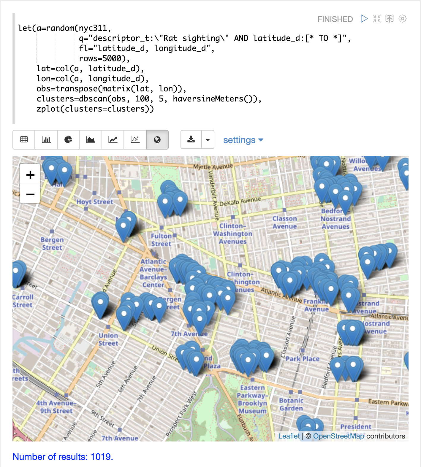
Notice in the visualization that only 1019 points were returned from the 5000 samples. This is the power of the DBSCAN algorithm to filter records that don’t match the criteria of a cluster. The points that are plotted all belong to clearly defined clusters.
The map visualization can be zoomed further to explore the locations of specific clusters. The example below shows a zoom into an area of dense clusters.
K-Means Clustering
The kmeans functions performs k-means clustering of the rows of a matrix.
Once the clustering has been completed there are a number of useful functions available
for examining and visualizing the clusters and centroids.
Clustered Scatter Plot
In this example we’ll again be clustering 2D lat/lon points of rat sightings. But unlike the DBSCAN example, k-means clustering does not on its own perform any noise reduction. So in order to reduce the noise a smaller random sample is selected from the data than was used for the DBSCAN example.
We’ll see that sampling itself is a powerful noise reduction tool which helps visualize the cluster density. This is because there is a higher probability that samples will be drawn from higher density clusters and a lower probability that samples will be drawn from lower density clusters.
In this example the random function draws a sample of 1500 records from the nyc311 (complaints database) collection where
the complaint description matches "rat sighting" and latitude is populated in the record. The latitude and longitude fields
are then vectorized and added as rows to a matrix. The matrix is transposed so each row contains a single latitude, longitude
point. The kmeans function is then used to cluster the latitude and longitude points into 21 clusters.
Finally, the zplot function is used to visualize the clusters as a scatter plot.
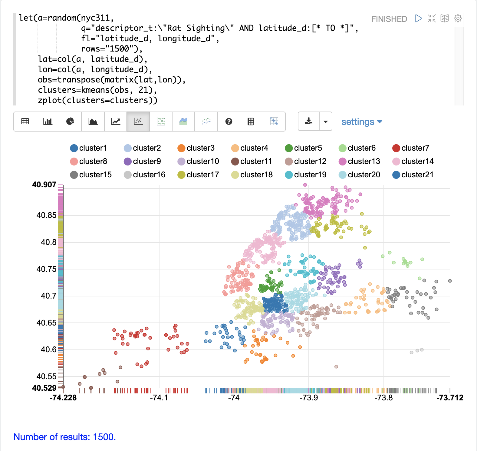
The scatter plot above shows each lat/lon point plotted on a Euclidean plain with longitude on the x-axis and latitude on the y-axis. The plot is dense enough so the outlines of the different boroughs are visible if you know the boroughs of New York City.
Each cluster is shown in a different color. This plot provides interesting insight into the densities of rat sightings throughout the five boroughs of New York City. For example it highlights a cluster of dense sightings in Brooklyn at cluster1 surrounded by less dense but still high activity clusters.
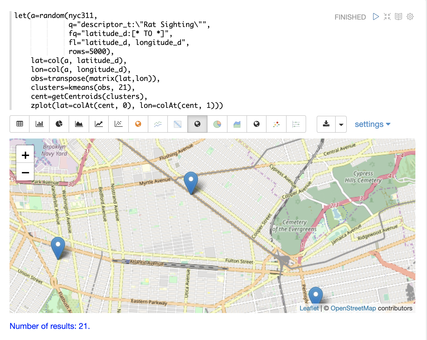
Plotting the Centroids
The centroids of each cluster can then be plotted on a map to visualize the center of the
clusters. In the example below the centroids are extracted from the clusters using the getCentroids
function, which returns a matrix of the centroids.
The centroids matrix contains 2D lat/lon points. The colAt function can then be used
to extract the latitude and longitude columns by index from the matrix so they can be
plotted with zplot. A map visualization is used below to display the centroids.
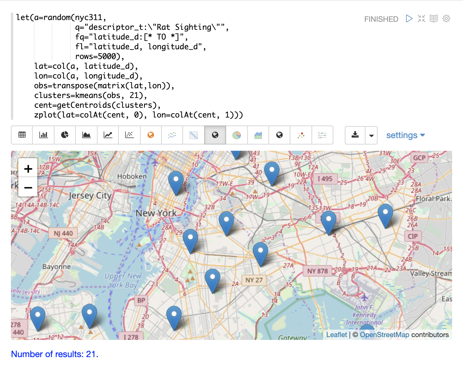
The map can then be zoomed to get a closer look at the centroids in the high density areas shown in the cluster scatter plot.
Phrase Extraction
K-means clustering produces centroids or prototype vectors which can be used to represent each cluster. In this example the key features of the centroids are extracted to represent the key phrases for clusters of TF-IDF term vectors.
| The example below works with TF-IDF term vectors. The section Text Analysis and Term Vectors offers a full explanation of this features. |
In the example the search function returns documents where the review_t field matches the phrase "star wars".
The select function is run over the result set and applies the analyze function
which uses the Lucene/Solr analyzer attached to the schema field text_bigrams to re-analyze the review_t
field. This analyzer returns bigrams which are then annotated to documents in a field called terms.
The termVectors function then creates TD-IDF term vectors from the bigrams stored in the terms field.
The kmeans function is then used to cluster the bigram term vectors into 5 clusters.
Finally the top 5 features are extracted from the centroids and returned.
Notice that the features are all bigram phrases with semantic significance.
let(a=select(search(reviews, q="review_t:\"star wars\"", rows="500"),
             id,
             analyze(review_t, text_bigrams) as terms),
    vectors=termVectors(a, maxDocFreq=.10, minDocFreq=.03, minTermLength=13, exclude="_,br,have"),
    clusters=kmeans(vectors, 5),
    centroids=getCentroids(clusters),
    phrases=topFeatures(centroids, 5))
When this expression is sent to the /stream handler it responds with:
{
  "result-set": {
    "docs": [
      {
        "phrases": [
          [
            "empire strikes",
            "rebel alliance",
            "princess leia",
            "luke skywalker",
            "phantom menace"
          ],
          [
            "original star",
            "main characters",
            "production values",
            "anakin skywalker",
            "luke skywalker"
          ],
          [
            "carrie fisher",
            "original films",
            "harrison ford",
            "luke skywalker",
            "ian mcdiarmid"
          ],
          [
            "phantom menace",
            "original trilogy",
            "harrison ford",
            "john williams",
            "empire strikes"
          ],
          [
            "science fiction",
            "fiction films",
            "forbidden planet",
            "character development",
            "worth watching"
          ]
        ]
      },
      {
        "EOF": true,
        "RESPONSE_TIME": 46
      }
    ]
  }
}
Multi K-Means Clustering
K-means clustering will produce different outcomes depending on the initial placement of the centroids. K-means is fast enough that multiple trials can be performed so that the best outcome can be selected.
The multiKmeans function runs the k-means clustering algorithm for a given number of trials and selects the
best result based on which trial produces the lowest intra-cluster variance.
The example below is identical to the phrase extraction example except that it uses multiKmeans with 15 trials,
rather than a single trial of the kmeans function.
let(a=select(search(reviews, q="review_t:\"star wars\"", rows="500"),
             id,
             analyze(review_t, text_bigrams) as terms),
    vectors=termVectors(a, maxDocFreq=.10, minDocFreq=.03, minTermLength=13, exclude="_,br,have"),
    clusters=multiKmeans(vectors, 5, 15),
    centroids=getCentroids(clusters),
    phrases=topFeatures(centroids, 5))
This expression returns the following response:
{
  "result-set": {
    "docs": [
      {
        "phrases": [
          [
            "science fiction",
            "original star",
            "production values",
            "fiction films",
            "forbidden planet"
          ],
          [
            "empire strikes",
            "princess leia",
            "luke skywalker",
            "phantom menace"
          ],
          [
            "carrie fisher",
            "harrison ford",
            "luke skywalker",
            "empire strikes",
            "original films"
          ],
          [
            "phantom menace",
            "original trilogy",
            "harrison ford",
            "character development",
            "john williams"
          ],
          [
            "rebel alliance",
            "empire strikes",
            "princess leia",
            "original trilogy",
            "luke skywalker"
          ]
        ]
      },
      {
        "EOF": true,
        "RESPONSE_TIME": 84
      }
    ]
  }
}
Fuzzy K-Means Clustering
The fuzzyKmeans function is a soft clustering algorithm which
allows vectors to be assigned to more then one cluster. The fuzziness parameter
is a value between 1 and 2 that determines how fuzzy to make the cluster assignment.
After the clustering has been performed the getMembershipMatrix function can be called
on the clustering result to return a matrix describing the probabilities
of cluster membership for each vector.
This matrix can be used to understand relationships between clusters.
In the example below fuzzyKmeans is used to cluster the movie reviews matching the phrase "star wars".
But instead of looking at the clusters or centroids, the getMembershipMatrix is used to return the
membership probabilities for each document. The membership matrix is comprised of a row for each
vector that was clustered. There is a column in the matrix for each cluster.
The values in the matrix contain the probability that a specific vector belongs to a specific cluster.
In the example the distance function is then used to create a distance matrix from the columns of the
membership matrix. The distance matrix is then visualized with the zplot function as a heat map.
In the example cluster1 and cluster5 have the shortest distance between the clusters.
Further analysis of the features in both clusters can be performed to understand
the relationship between cluster1 and cluster5.
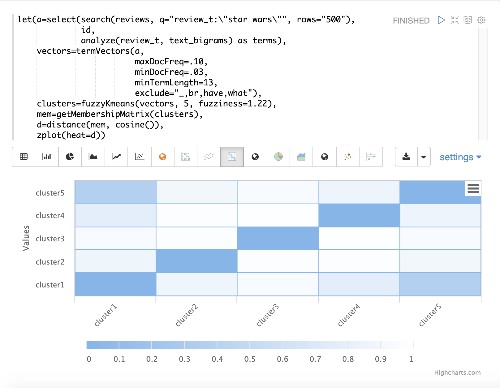
| The heat map has been configured to increase in color intensity as the distance shortens. |
Feature Scaling
Before performing machine learning operations its often necessary to scale the feature vectors so they can be compared at the same scale.
All the scaling functions below operate on vectors and matrices. When operating on a matrix the rows of the matrix are scaled.
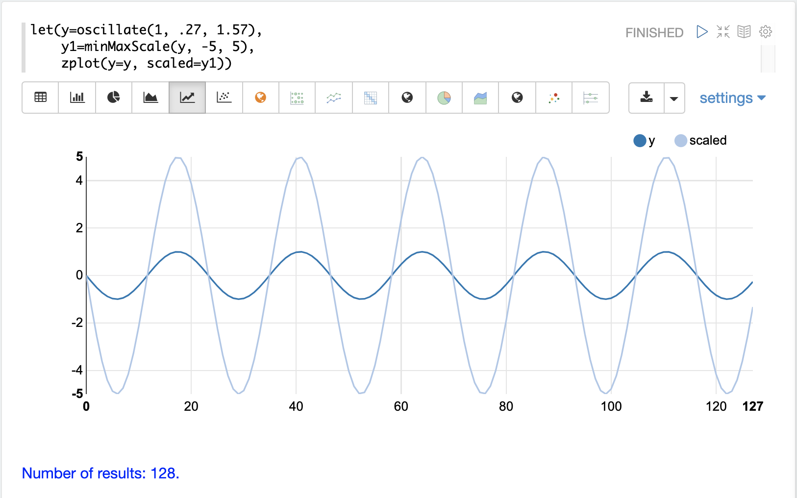
Min/Max Scaling
The minMaxScale function scales a vector or matrix between a minimum and maximum value.
By default it will scale between 0 and 1 if min/max values are not provided.
Below is a plot of a sine wave, with an amplitude of 1, before and after it has been scaled between -5 and 5.
Below is a simple example of min/max scaling of a matrix between 0 and 1. Notice that once brought into the same scale the vectors are the same.
let(a=array(20, 30, 40, 50),
    b=array(200, 300, 400, 500),
    c=matrix(a, b),
    d=minMaxScale(c))
When this expression is sent to the /stream handler it responds with:
{
  "result-set": {
    "docs": [
      {
        "d": [
          [
            0,
            0.3333333333333333,
            0.6666666666666666,
            1
          ],
          [
            0,
            0.3333333333333333,
            0.6666666666666666,
            1
          ]
        ]
      },
      {
        "EOF": true,
        "RESPONSE_TIME": 0
      }
    ]
  }
}
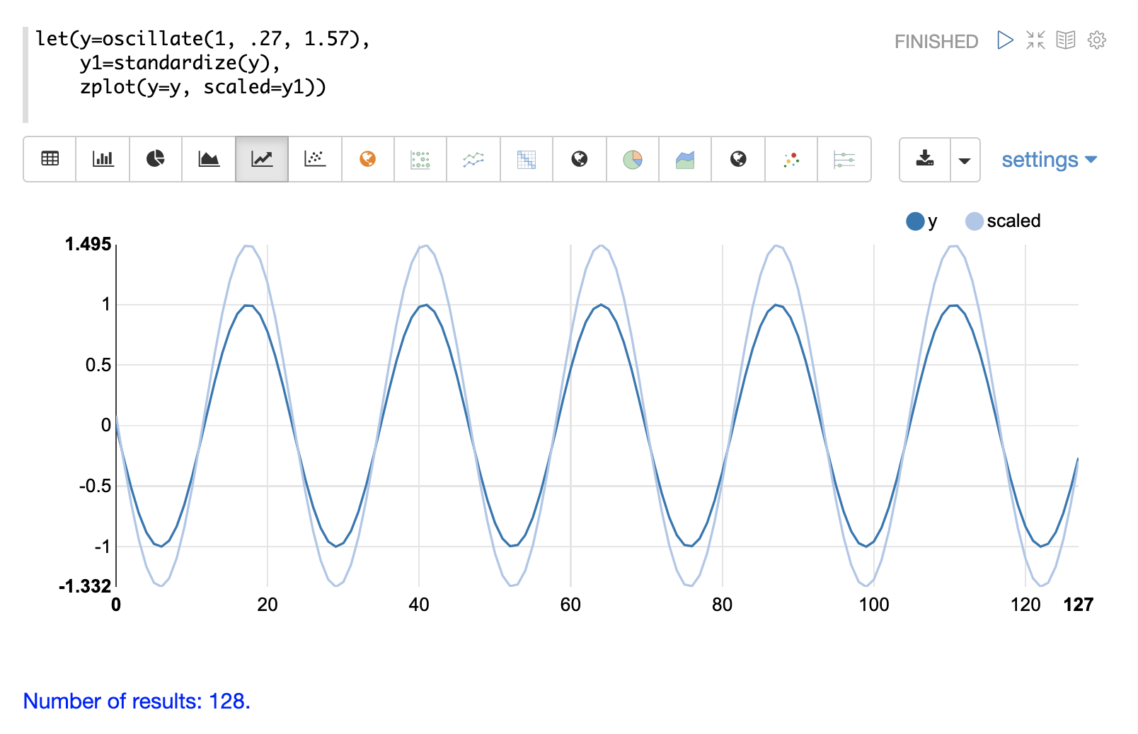
Standardization
The standardize function scales a vector so that it has a
mean of 0 and a standard deviation of 1.
Below is a plot of a sine wave, with an amplitude of 1, before and after it has been standardized.
Below is a simple example of of a standardized matrix. Notice that once brought into the same scale the vectors are the same.
let(a=array(20, 30, 40, 50),
    b=array(200, 300, 400, 500),
    c=matrix(a, b),
    d=standardize(c))
When this expression is sent to the /stream handler it responds with:
{
  "result-set": {
    "docs": [
      {
        "d": [
          [
            -1.161895003862225,
            -0.3872983346207417,
            0.3872983346207417,
            1.161895003862225
          ],
          [
            -1.1618950038622249,
            -0.38729833462074165,
            0.38729833462074165,
            1.1618950038622249
          ]
        ]
      },
      {
        "EOF": true,
        "RESPONSE_TIME": 17
      }
    ]
  }
}
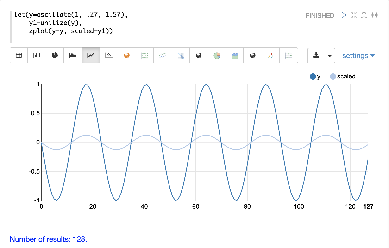
Unit Vectors
The unitize function scales vectors to a magnitude of 1. A vector with a
magnitude of 1 is known as a unit vector. Unit vectors are preferred
when the vector math deals with vector direction rather than magnitude.
Below is a plot of a sine wave, with an amplitude of 1, before and after it has been unitized.
Below is a simple example of a unitized matrix. Notice that once brought into the same scale the vectors are the same.
let(a=array(20, 30, 40, 50),
    b=array(200, 300, 400, 500),
    c=matrix(a, b),
    d=unitize(c))
When this expression is sent to the /stream handler it responds with:
{
  "result-set": {
    "docs": [
      {
        "d": [
          [
            0.2721655269759087,
            0.40824829046386296,
            0.5443310539518174,
            0.6804138174397716
          ],
          [
            0.2721655269759087,
            0.4082482904638631,
            0.5443310539518174,
            0.6804138174397717
          ]
        ]
      },
      {
        "EOF": true,
        "RESPONSE_TIME": 6
      }
    ]
  }
}