Log Analytics
This section of the user guide provides an introduction to Solr log analytics.
| This is an appendix of the Visual Guide to Streaming Expressions and Math Expressions. All the functions described below are covered in detail in the guide. See the Getting Started chapter to learn how to get started with visualizations and Apache Zeppelin. |
Loading
The out-of-the-box Solr log format can be loaded into a Solr index using the bin/postlogs command line tool
located in the bin/ directory of the Solr distribution.
If working from the source distribution the
distribution must first be built before postlogs can be run.
|
The postlogs script is designed to be run from the root directory of the Solr distribution.
The postlogs script takes two parameters:
Solr base URL (with collection):
http://localhost:8983/solr/logsFile path to root of the logs directory: All files found under this directory (including sub-directories) will be indexed. If the path points to a single log file only that log file will be loaded.
Below is a sample execution of the postlogs tool:
./bin/postlogs http://localhost:8983/solr/logs /var/logs/solrlogs
The example above will index all the log files under /var/logs/solrlogs to the logs collection found at the base url http://localhost:8983/solr.
Exploring
Log exploration is often the first step in log analytics and visualization.
When working with unfamiliar installations exploration can be used to understand which collections are covered in the logs, what shards and cores are in those collections and the types of operations being performed on those collections.
Even with familiar Solr installations exploration is still extremely important while troubleshooting because it will often turn up surprises such as unknown errors or unexpected admin or indexing operations.
Sampling
The first step in exploration is to take a random sample from the logs collection
with the random function.
In the example below the random function is run with one
parameter which is the name of the collection to sample.
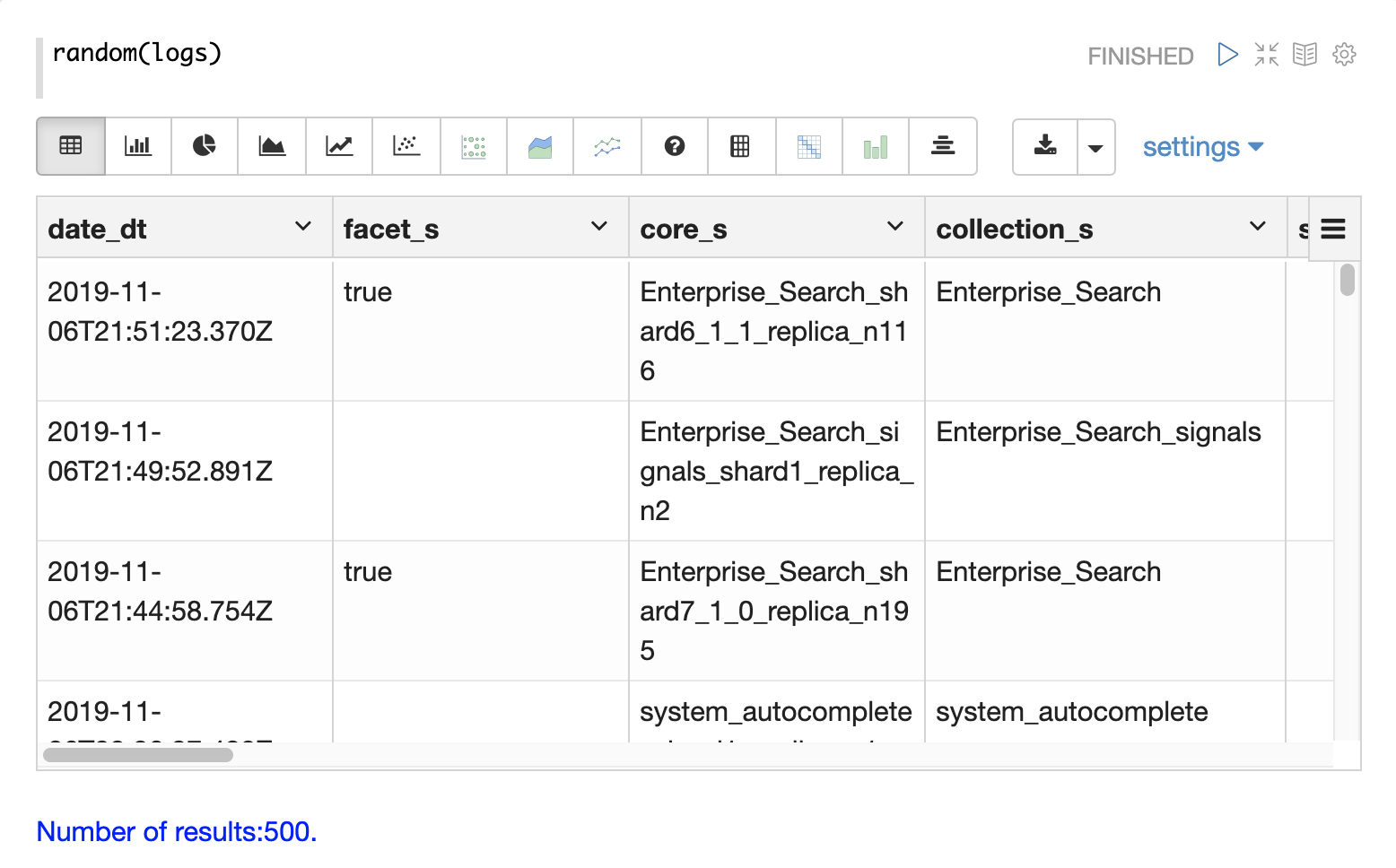
The sample contains 500 random records with the their full field list. By looking
at this sample we can quickly learn about the fields available in the logs collection.
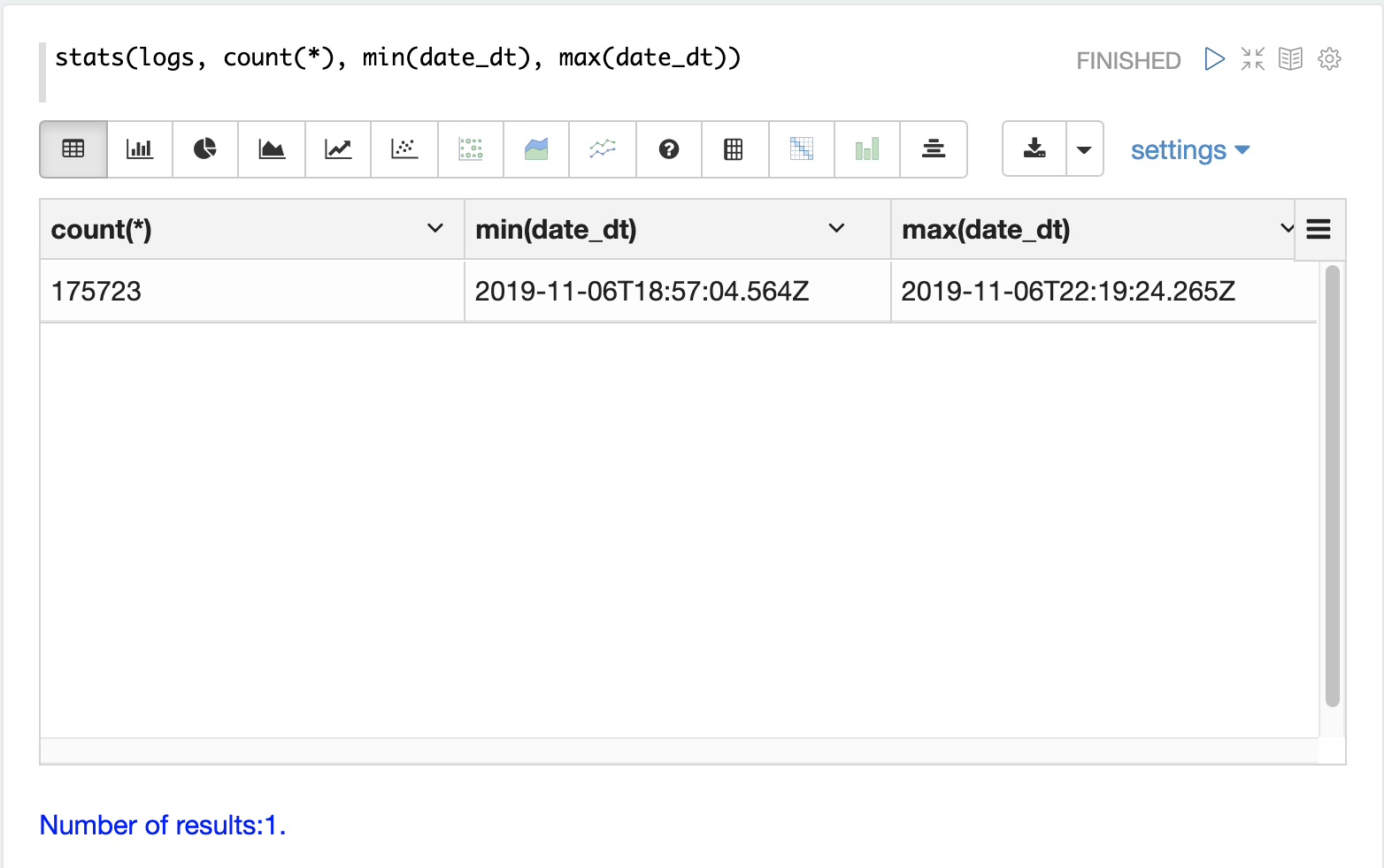
Time Period
Each log record contains a time stamp in the date_dt field.
Its often useful to understand what time period the logs cover and how many log records have been
indexed.
The stats function can be run to display this information.
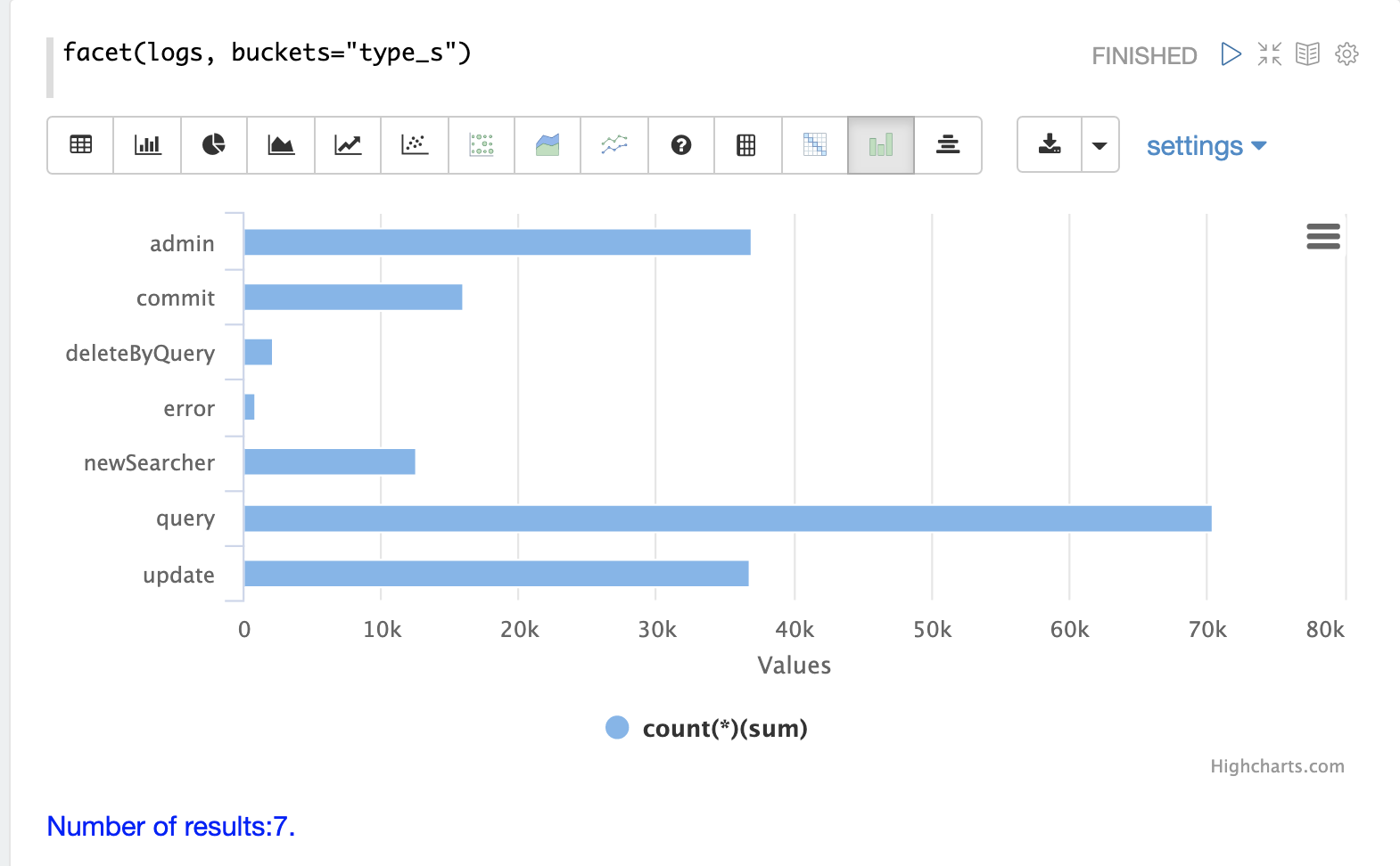
Record Types
One of the key fields in the index is the type_s field which is the type of log
record.
The facet expression can be used to visualize the different types of log records and how many
records of each type are in the index.
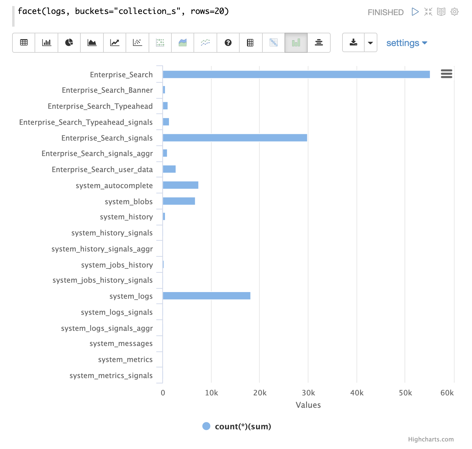
Collections
Another important field is the collection_s field which is the collection that the
log record was generated from.
The facet expression can be used to visualize the different collections and how many log records
they generate.
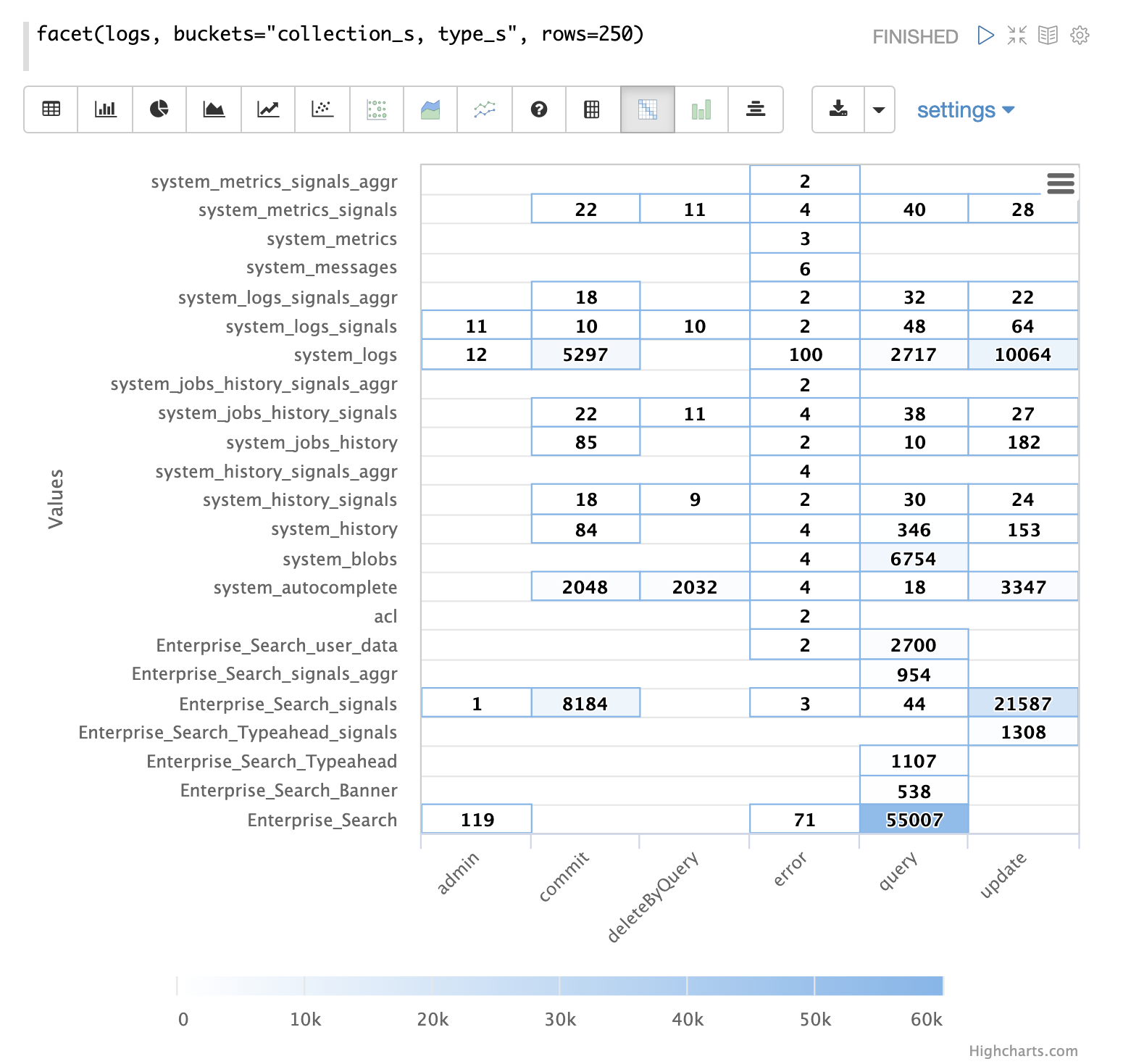
Record Type by Collection
A two dimensional facet can be run to visualize the record types by collection.
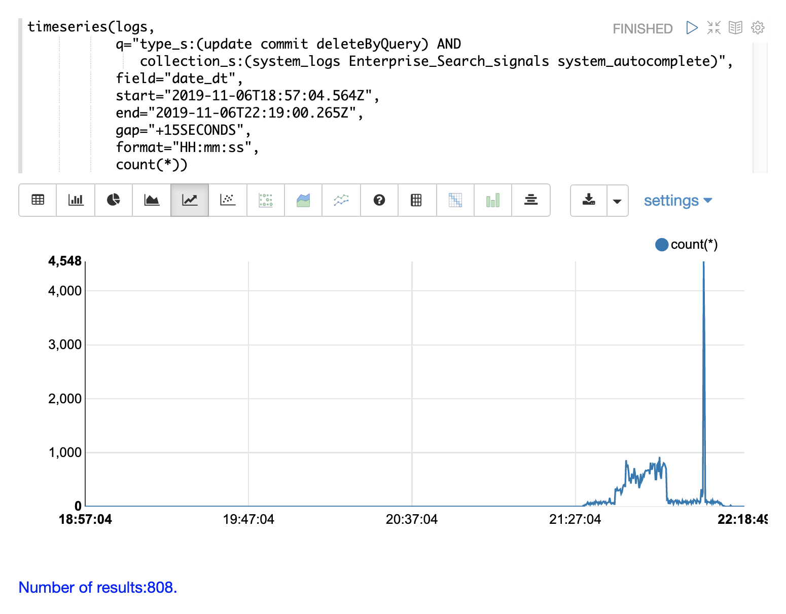
Time Series
The timeseries function can be used to visualize a time series for a specific time range
of the logs.
In the example below a time series is used to visualize the log record counts at 15 second intervals.
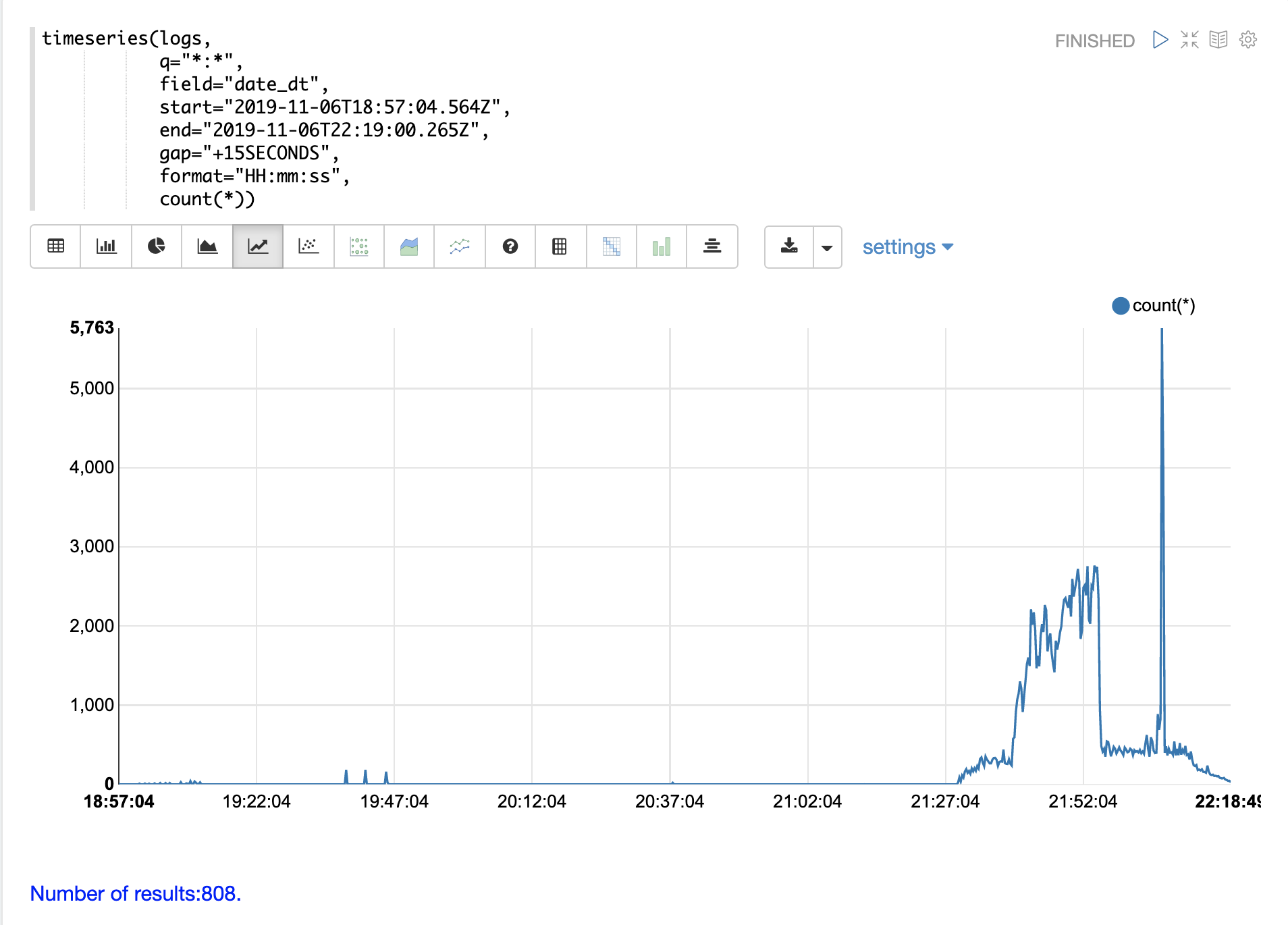
Notice that there is a very low level of log activity up until hour 21 minute 27. Then a burst of log activity occurs from minute 27 to minute 52.
This is then followed by a large spike of log activity.
The example below breaks this down further by adding a query on the type_s field to only
visualize query activity in the log.
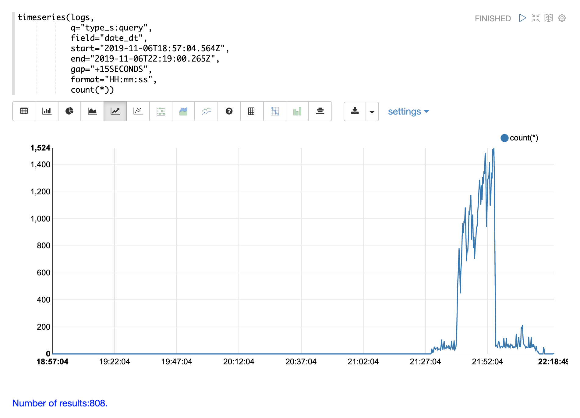
Notice the query activity accounts for more then half of the burst of log records between 21:27 and 21:52. But the query activity does not account for the large spike in log activity that follows.
We can account for that spike by changing the search to include only update, commit, and deleteByQuery records in the logs. We can also narrow by collection so we know where these activities are taking place.
Through the various exploratory queries and visualizations we now have a much better understanding of what’s contained in the logs.
Query Counting
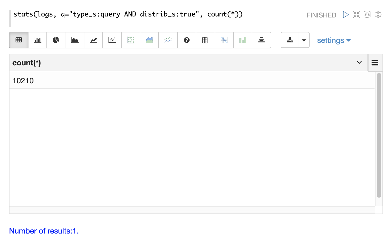
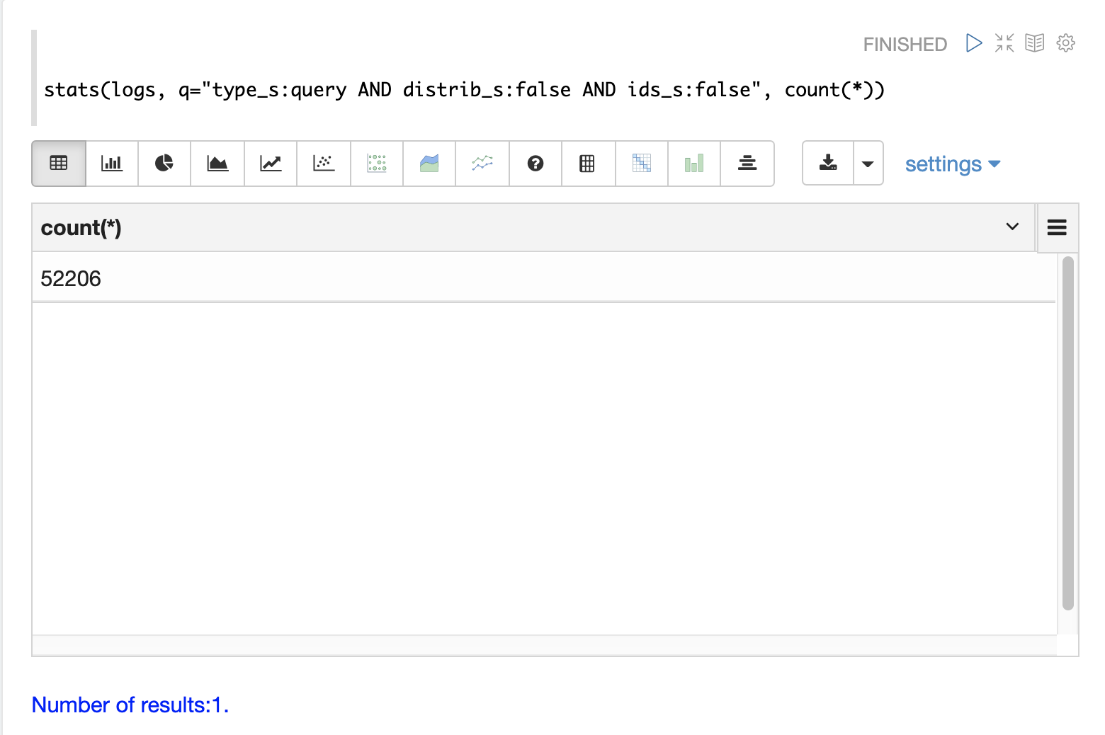
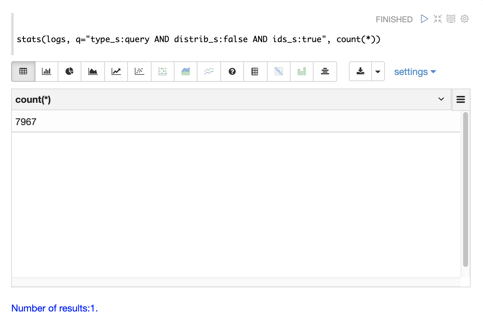
Distributed searches produce more than one log record for each query. There will be one top level log record for the top level distributed query and a shard level log record on one replica from each shard. There may also be a set of ids queries to retrieve fields by id from the shards to complete the page of results.
There are fields in the log index that can be used to differentiate between the three types of query records.
The examples below use the stats function to count the different types of query records in the logs.
The same queries can be used with search, random and timeseries functions to return results
for specific types of query records.
Top Level Queries
To find all the top level queries in the logs, add a query to limit results to log records with distrib_s:true as follows:
Shard Level Queries
To find all the shard level queries that are not IDs queries, adjust the query to limit results to logs with distrib_s:false AND ids_s:false
as follows:
ID Queries
To find all the ids queries, adjust the query to limit results to logs with distrib_s:false AND ids_s:true
as follows:
Query Performance
One of the important tasks of Solr log analytics is understanding how well a Solr cluster is performing.
The qtime_i field contains the query time (QTime) in milliseconds
from the log records.
There are number of powerful visualizations and statistical approaches for analyzing query performance.
QTime Scatter Plot
Scatter plots can be used to visualize random samples of the qtime_i
field.
The example below demonstrates a scatter plot of 500 random samples
from the ptest1 collection of log records.
In this example, qtime_i is plotted on the y-axis and the x-axis is simply a sequence to spread the query times out across the plot.
The x field is included in the field list.
The random function automatically generates a sequence for the x-axis when x is included in the field list.
|
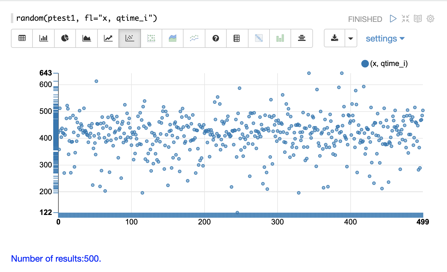
From this scatter plot we can tell a number of important things about the query times:
The sample query times range from a low of 122 to a high of 643.
The mean appears to be just above 400 ms.
The query times tend to cluster closer to the mean and become less frequent as they move away from the mean.
Highest QTime Scatter Plot
It’s often useful to be able to visualize the highest query times recorded in the log data.
This can be done by using the search function and sorting on qtime_i desc.
In the example below the search function returns the highest 500 query times from the ptest1 collection and sets the results to the variable a.
Then the col function is used to extract the qtime_i column from the result set into a vector, which is set to variable y.
Then the zplot function is used plot the query times on the y-axis of the scatter plot.
The rev function is used to reverse the query times vector so the visualization displays from lowest to highest query times.
|
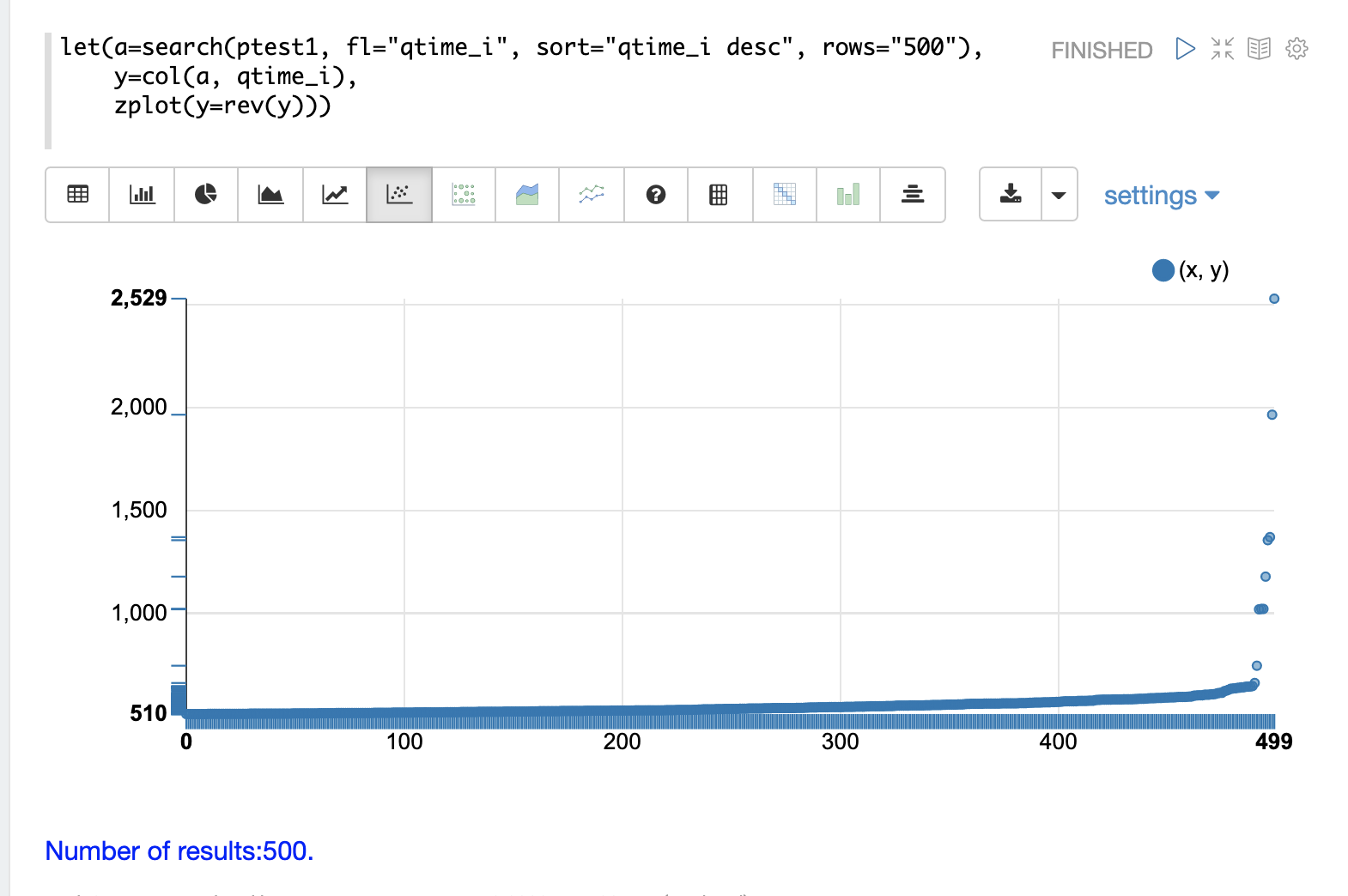
From this plot we can see that the 500 highest query times start at 510ms and slowly move higher, until the last 10 spike upwards, culminating at the highest query time of 2529ms.
QTime Distribution
In this example a visualization is created which shows the distribution of query times rounded to the nearest second.
The example below starts by taking a random sample of 10000 log records with a type_s* of query.
The results of the random function are assigned to the variable a.
The col function is then used extract the qtime_i field from the results.
The vector of query times is set to variable b.
The scalarDivide function is then used to divide all elements of the query time vector by 1000.
This converts the query times from milli-seconds to seconds.
The result is set to variable c.
The round function then rounds all elements of the query times vector to the nearest second.
This means all query times less than 500ms will round to 0.
The freqTable function is then applied to the vector of query times rounded to
the nearest second.
The resulting frequency table is shown in the visualization below. The x-axis is the number of seconds. The y-axis is the number of query times that rounded to each second.
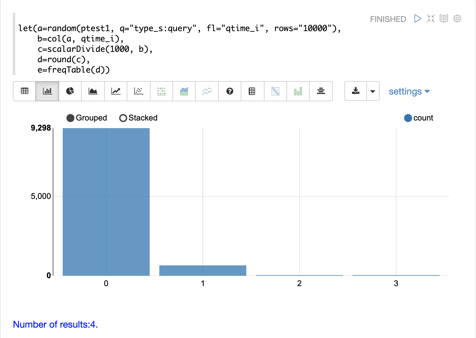
Notice that roughly 93 percent of the query times rounded to 0, meaning they were under 500ms. About 6 percent round to 1 and the rest rounded to either 2 or 3 seconds.
QTime Percentiles Plot
A percentile plot is another powerful tool for understanding the distribution of query times in the logs. The example below demonstrates how to create and interpret percentile plots.
In this example an array of percentiles is created and set to variable p.
Then a random sample of 10000 log records is drawn and set to variable a.
The col function is then used to extract the qtime_i field from the sample results and this vector is set to variable b.
The percentile function is then used to calculate the value at each percentile for the vector of query times.
The array of percentiles set to variable p tells the percentile function
which percentiles to calculate.
Then the zplot function is used to plot the percentiles on the x-axis and
the query time at each percentile on the y-axis.
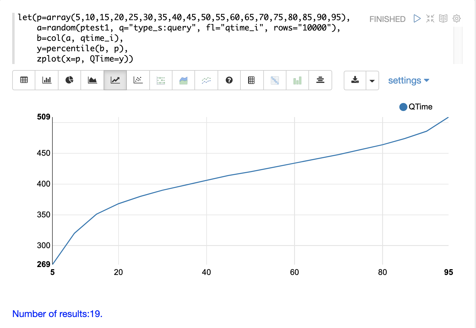
From the plot we can see that the 80th percentile has a query time of 464ms. This means that 80% percent of queries are below 464ms.
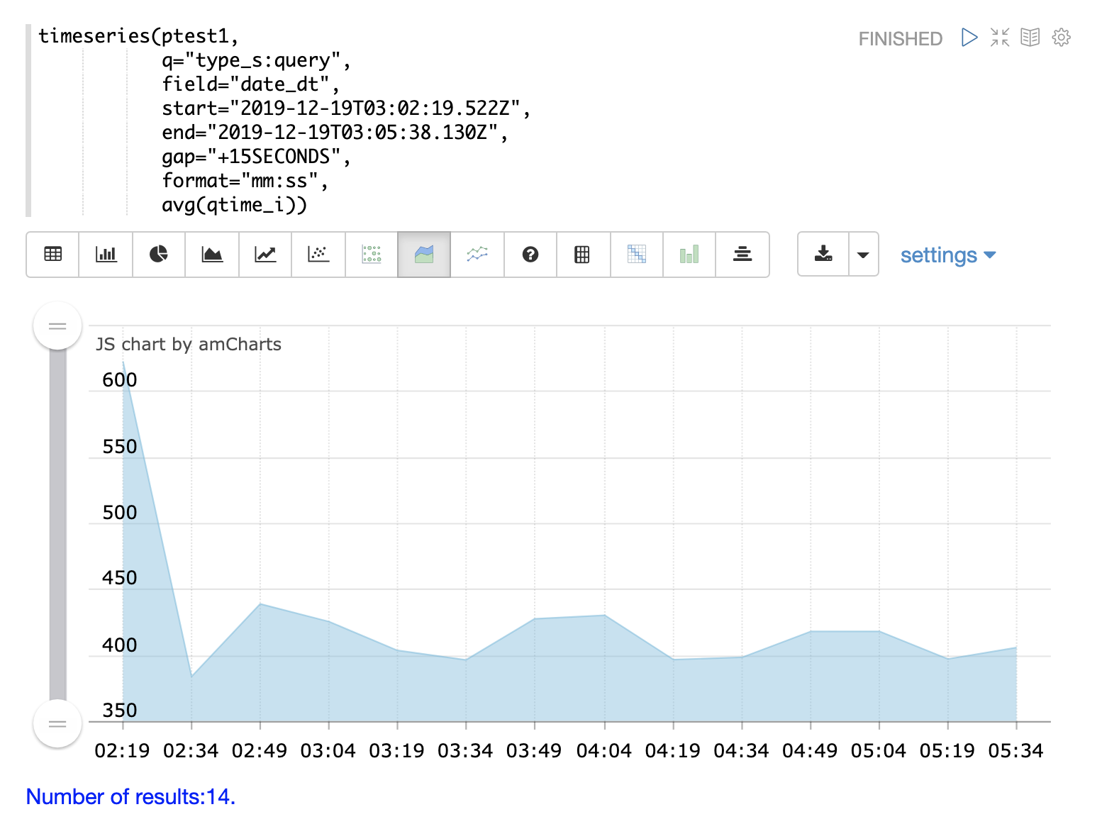
QTime Time Series
A time series aggregation can also be run to visualization how QTime changes over time.
The example below shows a time series, area chart that visualizes average query time at 15 second intervals for a 3 minute section of a log.
Performance Troubleshooting
If query analysis determines that queries are not performing as expected then log analysis can also be used to troubleshoot the cause of the slowness. The section below demonstrates several approaches for locating the source of query slowness.
Slow Nodes
In a distributed search the final search performance is only as fast as the slowest responding shard in the cluster. Therefore one slow node can be responsible for slow overall search time.
The fields core_s, replica_s and shard_s are available in the log records.
These fields allow average query time to be calculated by core, replica or shard.
The core_s field is particularly useful as its the most granular element and
the naming convention often includes the collection, shard and replica information.
The example below uses the facet function to calculate avg(qtime_i) by core.
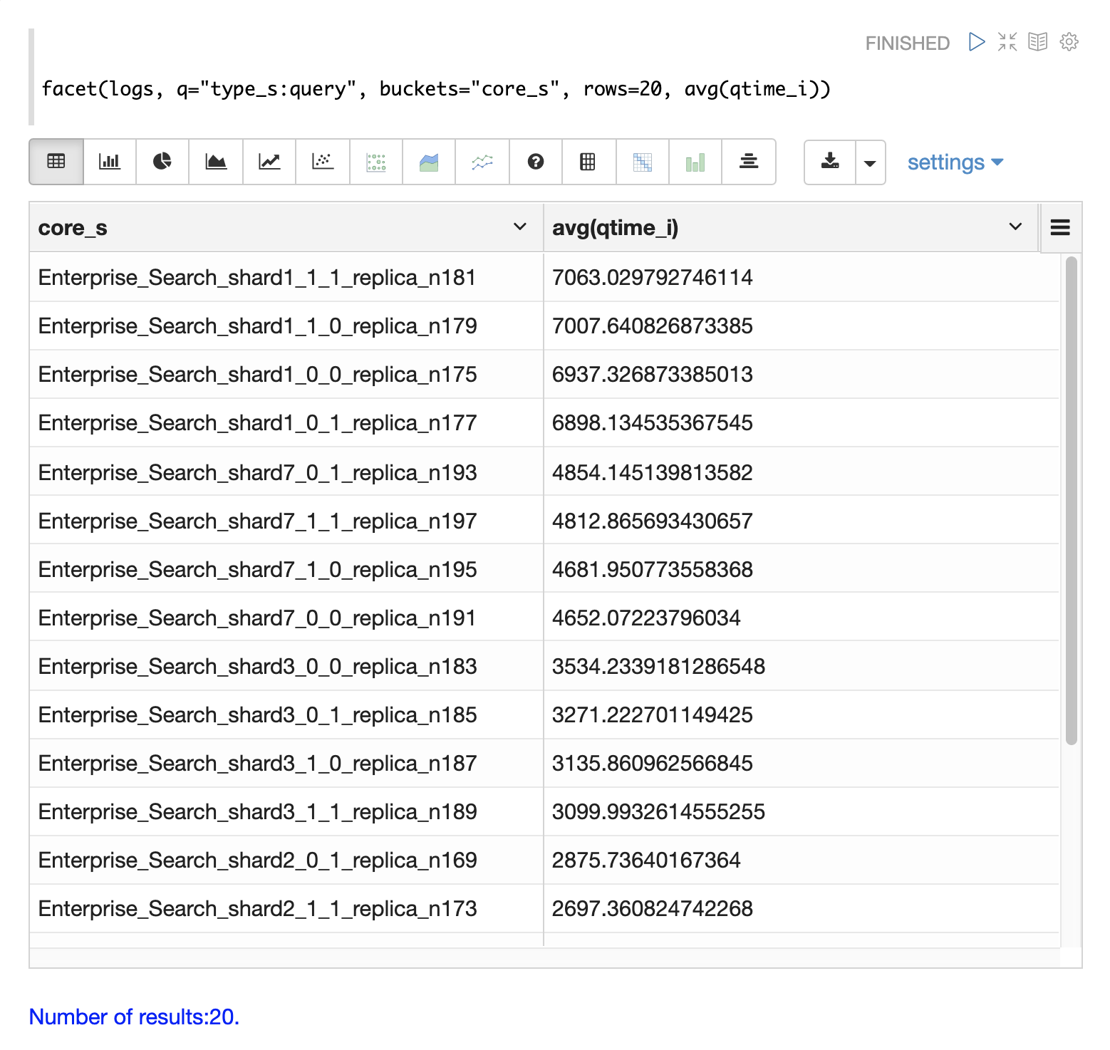
Notice in the results that the core_s field contains information about the
collection, shard, and replica.
The example also shows that qtime seems to be significantly higher for certain cores in the same collection.
This should trigger a deeper investigation as to why those cores might be performing slower.
Slow Queries
If query analysis shows that most queries are performing well but there are outlier queries that are slow, one reason for this may be that specific queries are slow.
The q_s and q_t fields both hold the value of the q parameter from Solr requests.
The q_s field is a string field and the q_t field has been tokenized.
The search function can be used to return the top N slowest queries in the logs by sorting the results by qtime_i desc. the example
below demonstrates this:
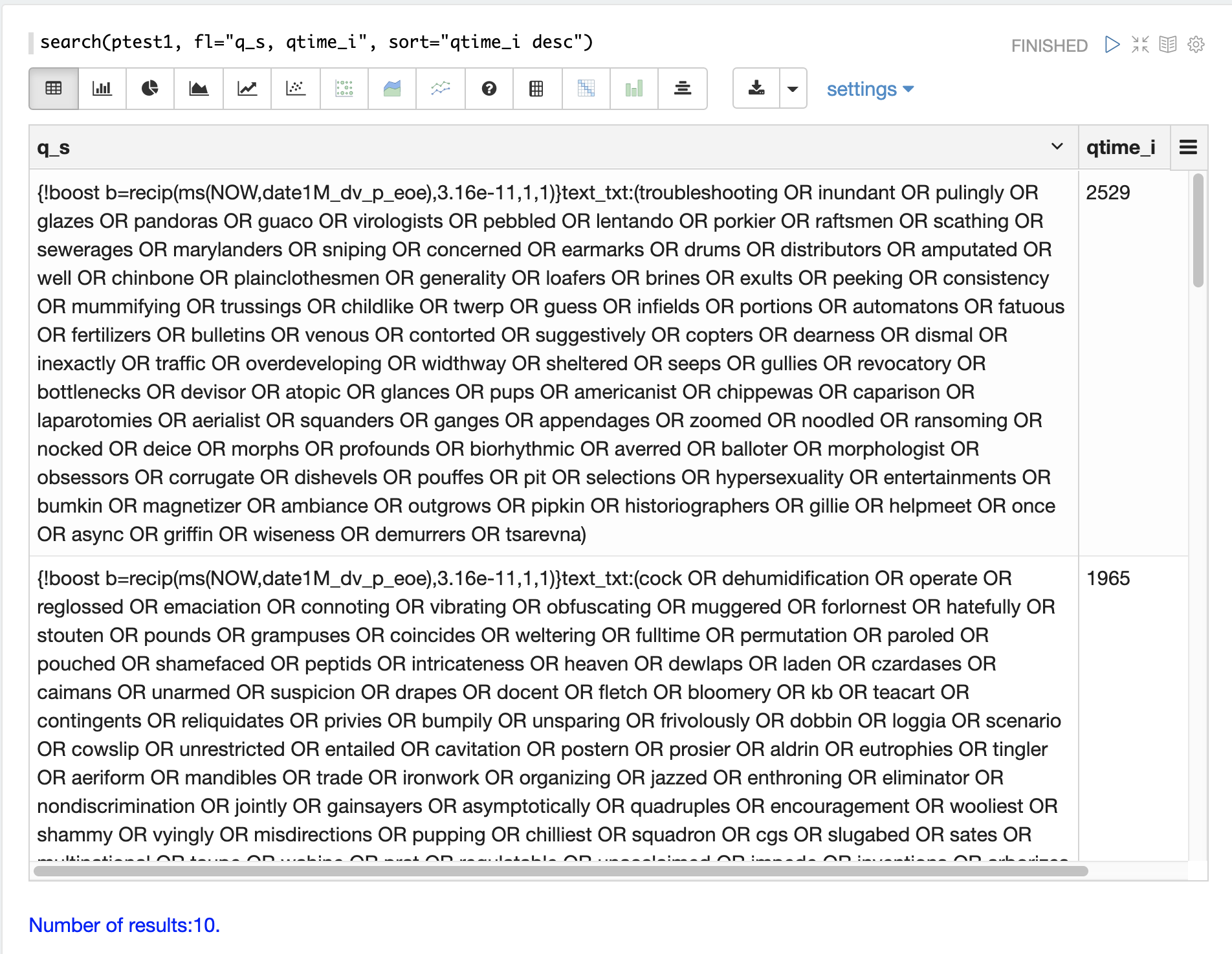
Once the queries have been retrieved they can be inspected and tried individually to determine if the query is consistently slow. If the query is shown to be slow a plan to improve the query performance can be devised.
Commits
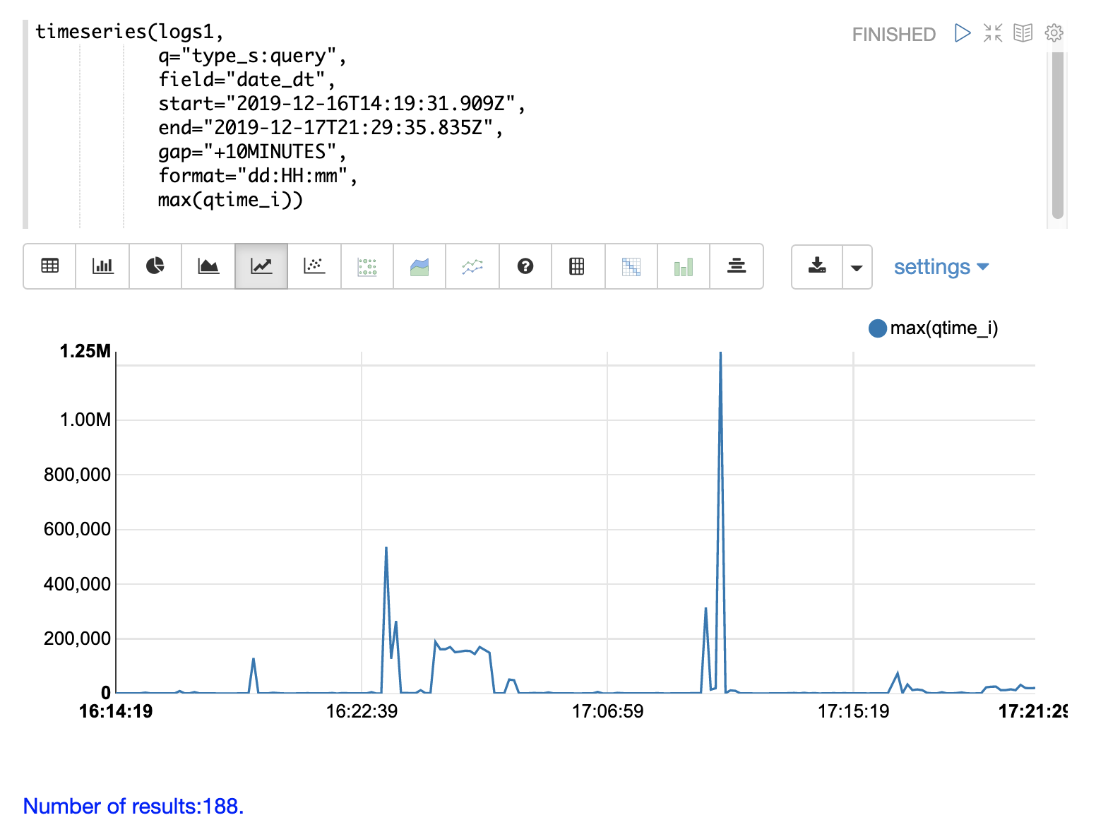
Commits and activities that cause commits, such as full index replications, can result in slower query performance. Time series visualization can help to determine if commits are related to degraded performance.
The first step is to visualize the query performance issue.
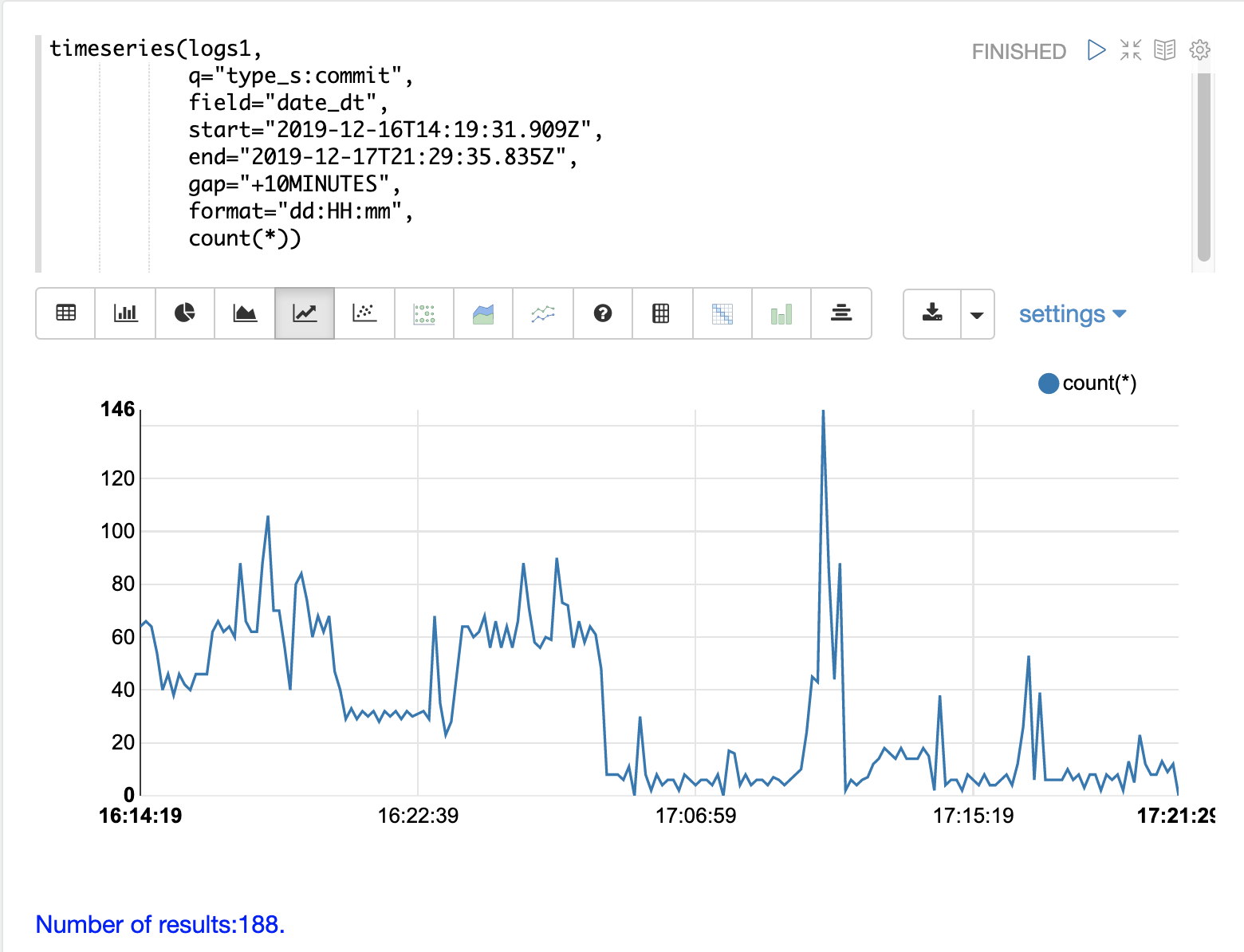
The time series below limits the log results to records that are type query and computes the max(qtime_i) at ten minute intervals.
The plot shows the day, hour and minute on the x-axis and max(qtime_i) in milliseconds on the y-axis.
Notice there are some extreme spikes in max qtime_i that need to be understood.
The next step is to generate a time series that counts commits across the same time intervals.
The time series below uses the same start, end and gap as the initial time series.
But this time series is computed for records that have a type of commit.
The count for the commits is calculated and plotted on y-axis.
Notice that there are spikes in commit activity that appear near the spikes in max qtime_i.
The final step is to overlay the two time series in the same plot.
This is done by performing both time series and setting the results to variables, in this case
a and b.
Then the date_dt and max(qtime_i) fields are extracted as vectors from the first time series and set to variables using the col function.
And the count(*) field is extracted from the second time series.
The zplot function is then used to plot the time stamp vector on the x-axis and the max qtimes and commit count vectors on y-axis.
The minMaxScale function is used to scale both vectors
between 0 and 1 so they can be visually compared on the same plot.
|
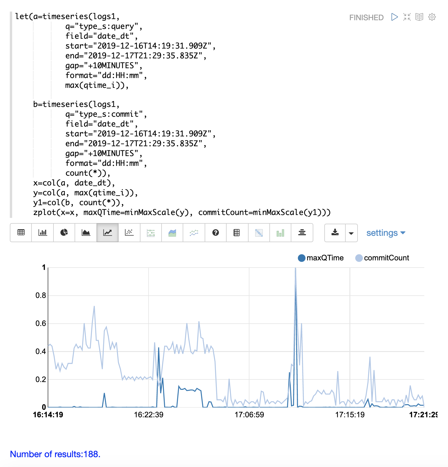
Notice in this plot that the commit count seems to be closely related to spikes
in max qtime_i.
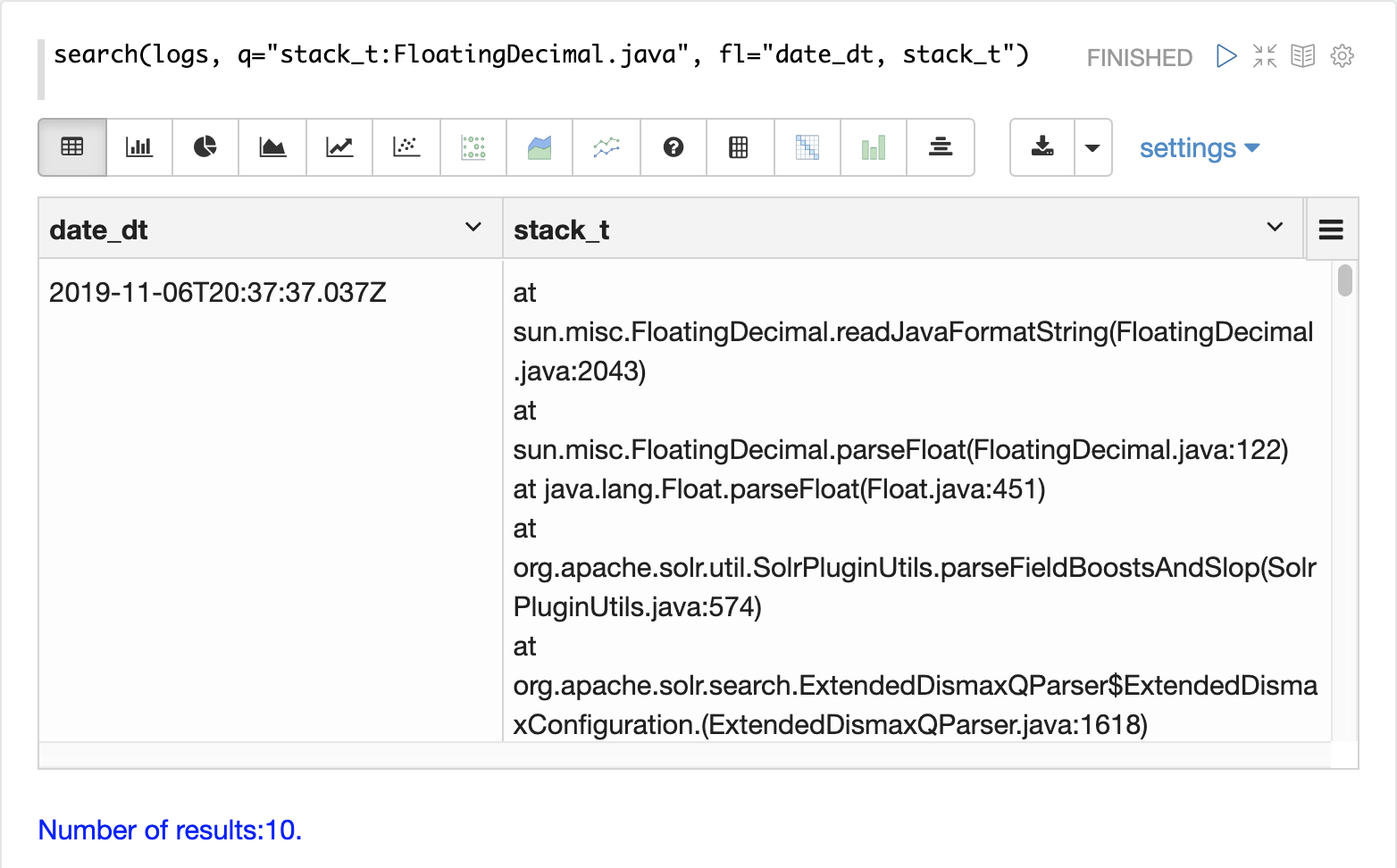
Errors
The log index will contain any error records found in the logs. Error records will have a type_s field value of error.
The example below searches for error records:
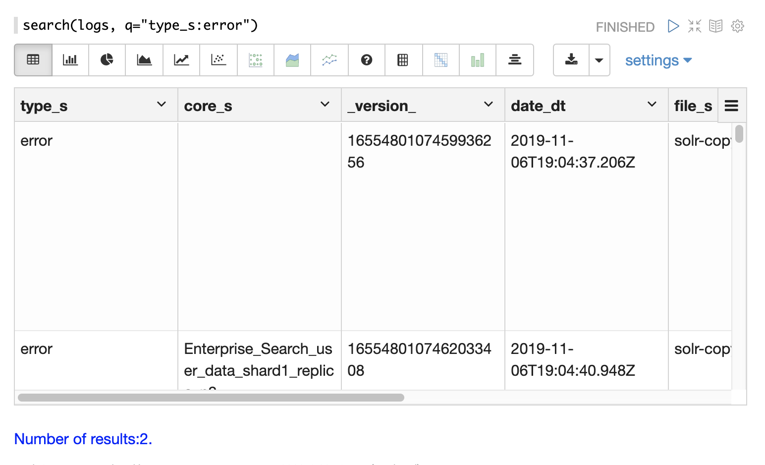
If the error is followed by a stack trace the stack trace will be present in the searchable field stack_t.
The example below shows a search on the stack_t field and the stack trace presented in the result.