Searching, Sampling and Aggregation
Data is the indispensable factor in statistical analysis. This section provides an overview of the key functions for retrieving data for visualization and statistical analysis: searching, sampling and aggregation.
Searching
Exploring
The search function can be used to search a SolrCloud collection and return a
result set.
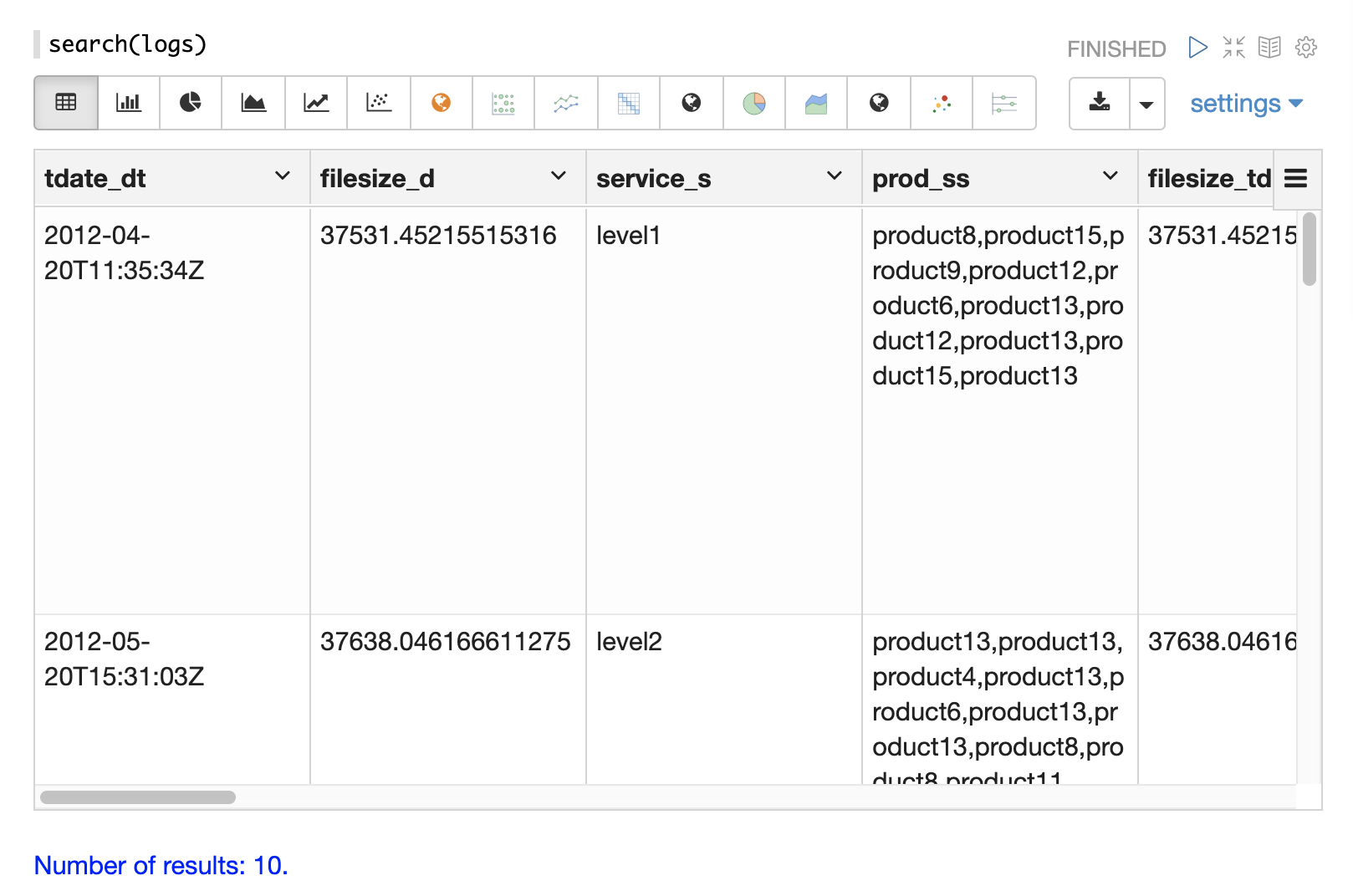
Below is an example of the most basic search function called from the Zeppelin-Solr interpreter.
Zeppelin-Solr sends the seach(logs) call to the /stream handler and displays the results
in table format.
In the example the search function is passed only the name of the collection being searched.
This returns a result set of 10 records with all fields.
This simple function is useful for exploring the fields in the data and understanding how to start refining the search criteria.
Searching and Sorting
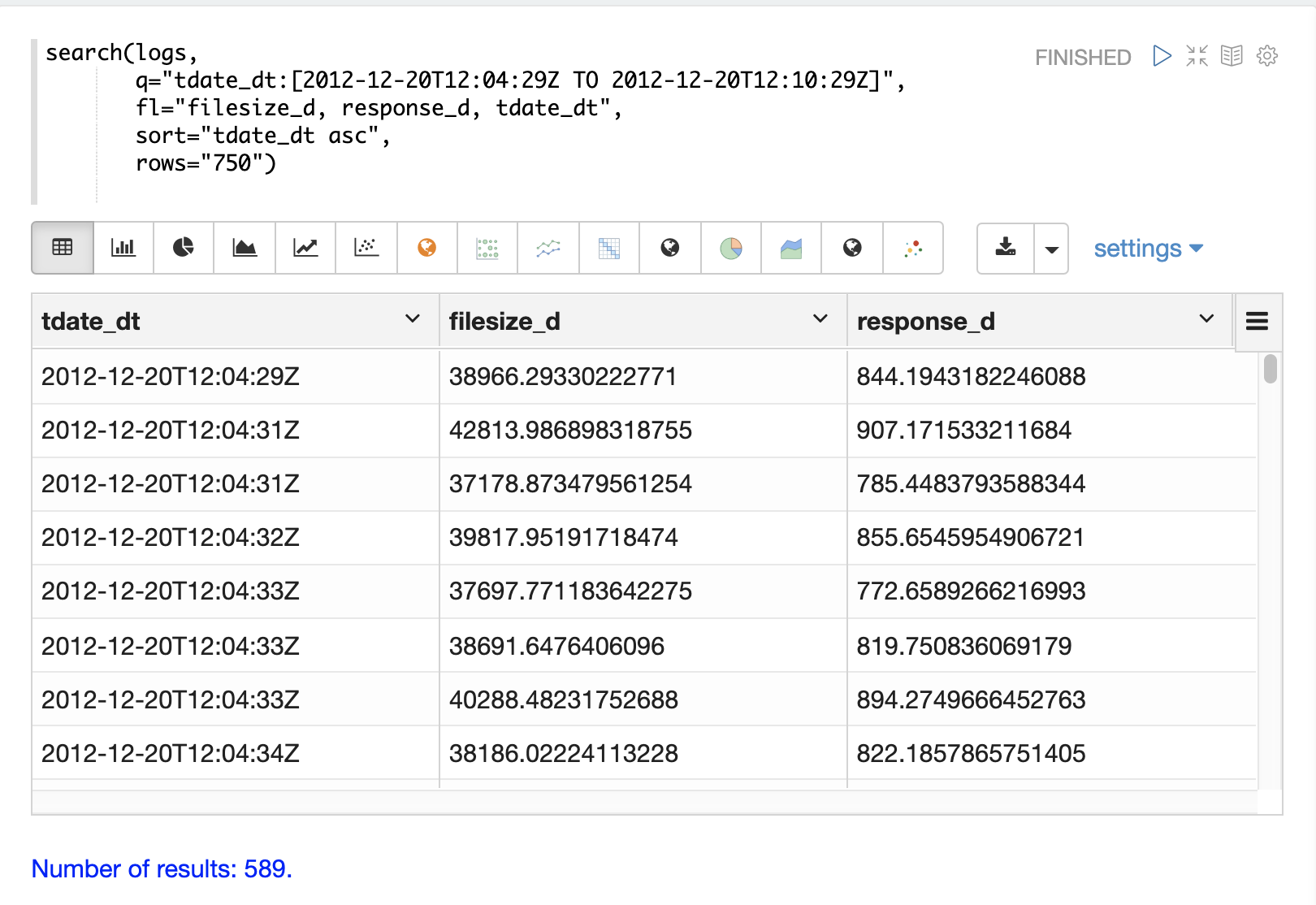
Once the format of the records is known, parameters can be added to the search function to begin analyzing the data.
In the example below a search query, field list, rows and sort have been added to the search function.
Now the search is limited to records within a specific time range and returns
a maximum result set of 750 records sorted by tdate_dt ascending.
We have also limited the result set to three specific fields.
Once the data is loaded into the table we can switch to a scatter plot and plot the filesize_d column
on the x-axis and the response_d column on the y-axis.
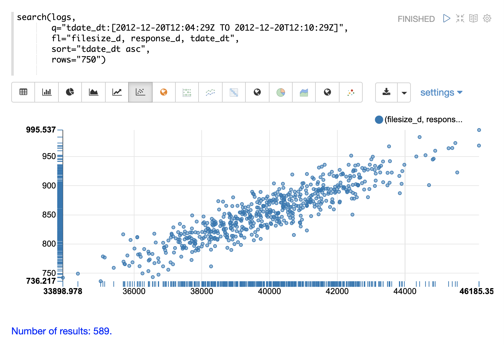
This allows us to quickly visualize the relationship between two variables selected from a very specific slice of the index.
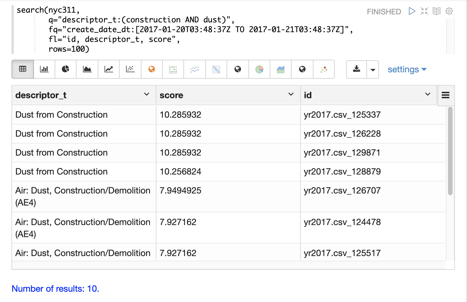
Scoring
The search function will score and rank documents when a query is performed on
a text field. The example below shows an example of the scoring and ranking of results.
Sampling
The random function returns a random sample from a distributed search result set.
This allows for fast visualization, statistical analysis, and modeling of
samples that can be used to infer information about the larger result set.
The visualization examples below use small random samples, but Solr’s random sampling provides sub-second response times on sample sizes of over 200,000. These larger samples can be used to build reliable statistical models that describe large data sets (billions of documents) with sub-second performance.
The examples below demonstrate univariate and bivariate scatter plots of random samples. Statistical modeling with random samples is covered in the Statistics, Probability, Linear Regression, Curve Fitting, and Machine Learning sections.
Univariate Scatter Plots
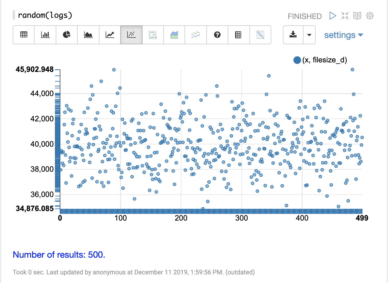
In the example below the random function is called in its simplest form with just a collection name as the parameter.
When called with no other parameters the random function returns a random sample of 500 records with all fields from the collection.
When called without the field list parameter (fl) the random function also generates a sequence, 0-499 in this case, which can be used for plotting the x-axis.
This sequence is returned in a field called x.
The visualization below shows a scatter plot with the filesize_d field
plotted on the y-axis and the x sequence plotted on the x-axis.
The effect of this is to spread the filesize_d samples across the length
of the plot so they can be more easily studied.
By studying the scatter plot we can learn a number of things about the
distribution of the filesize_d variable:
The sample set ranges from 34,875 to 45,902.
The highest density appears to be at about 40,000.
The sample seems to have a balanced number of observations above and below 40,000. Based on this the mean and mode would appear to be around 40,000.
The number of observations tapers off to a small number of outliers on the and low and high end of the sample.
This sample can be re-run multiple times to see if the samples produce similar plots.
Bivariate Scatter Plots
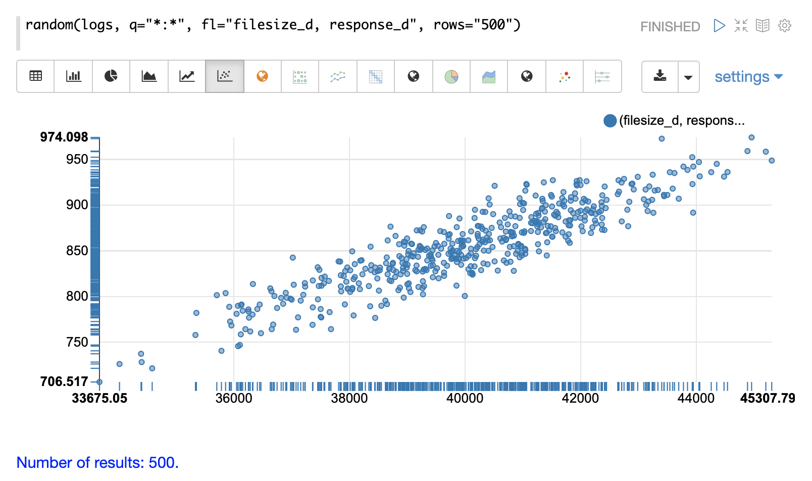
In the next example parameters have been added to the random function.
The field list (fl) now specifies two fields to be
returned with each sample: filesize_d and response_d.
The q and rows parameters are the same as the defaults but are included as an example of how to set these parameters.
By plotting filesize_d on the x-axis and response_d on the y-axis we can begin to study the relationship between the two variables.
By studying the scatter plot we can learn the following:
As
filesize_drises,response_dtends to rise.This relationship appears to be linear, as a straight line put through the data could be used to model the relationship.
The points appear to cluster more densely along a straight line through the middle and become less dense as they move away from the line.
The variance of the data at each
filesize_dpoint seems fairly consistent. This means a predictive model would have consistent error across the range of predictions.
Aggregation
Aggregations are a powerful statistical tool for summarizing large data sets and surfacing patterns, trends, and correlations within the data. Aggregations are also a powerful tool for visualization and provide data sets for further statistical analysis.
stats
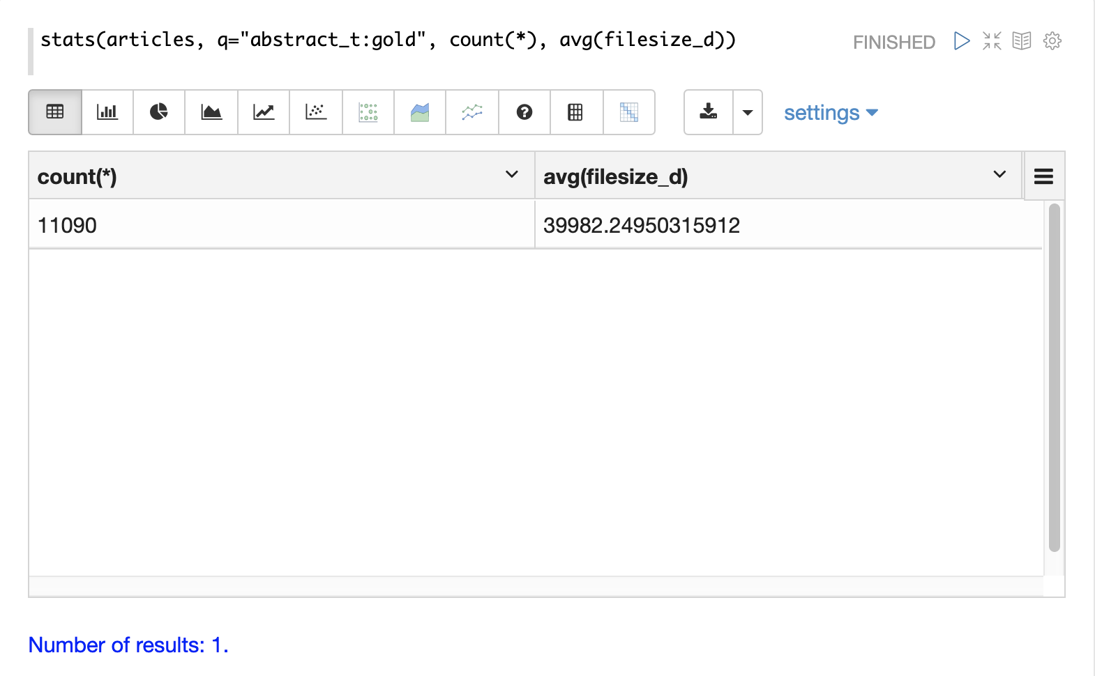
The simplest aggregation is the stats function.
The stats function calculates aggregations for an entire result set that matches a query.
The stats function supports the following aggregation functions: count(*), sum, min, max, and avg.
Any number and combination of statistics can be calculated in a single function call.
The stats function can be visualized in Zeppelin-Solr as a table.
In the example below two statistics are calculated over a result set and are displayed in a table:
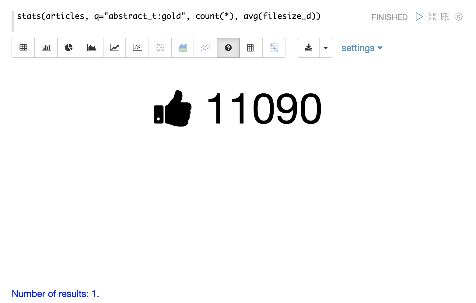
The stats function can also be visualized using the number visualization which is used to highlight important numbers.
The example below shows the count(*) aggregation displayed in the number visualization:
facet
The facet function performs single and multi-dimension
aggregations that behave in a similar manner to SQL group by aggregations.
Under the covers the facet function pushes down the aggregations to Solr’s
JSON Facet API for fast distributed execution.
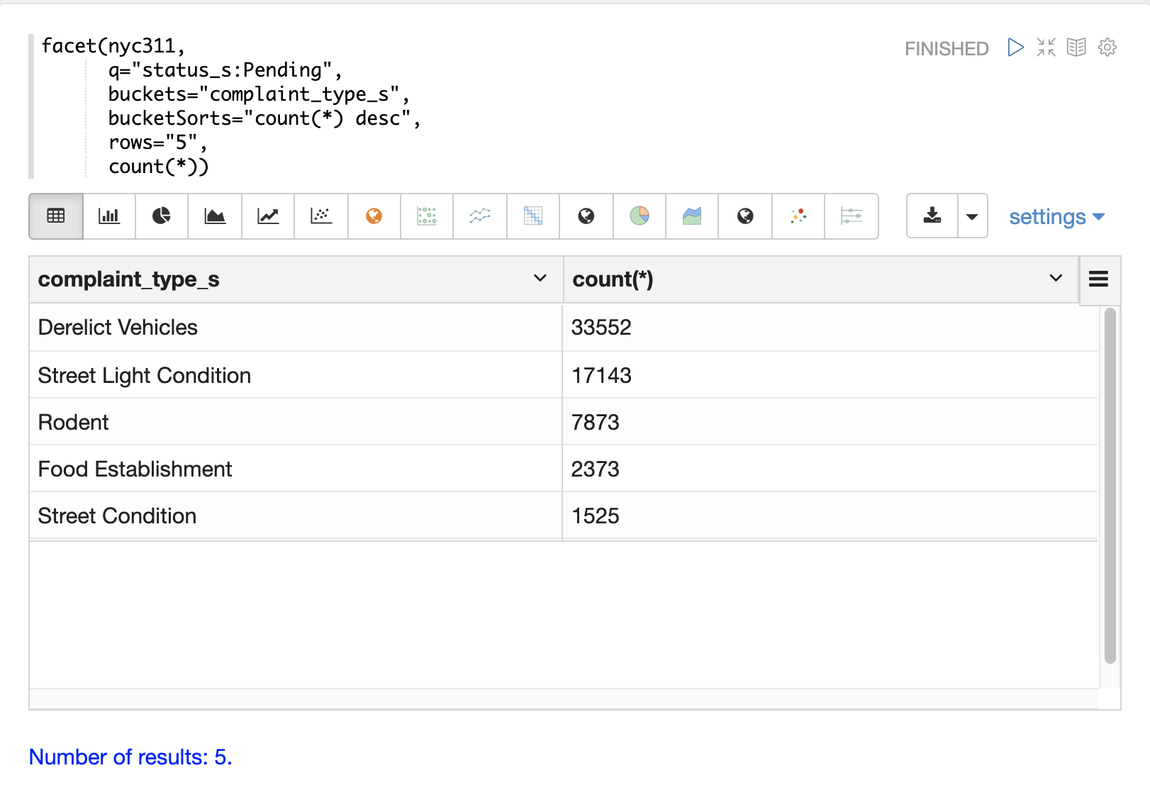
The example below performs a single dimension aggregation from the nyc311 (NYC complaints) dataset. The aggregation returns the top five complaint types by count for records with a status of Pending. The results are displayed with Zeppelin-Solr in a table.
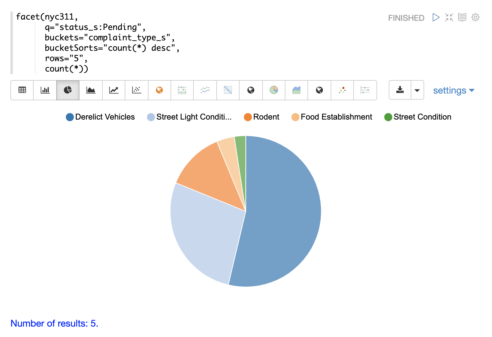
The example below shows the table visualized using a pie chart.
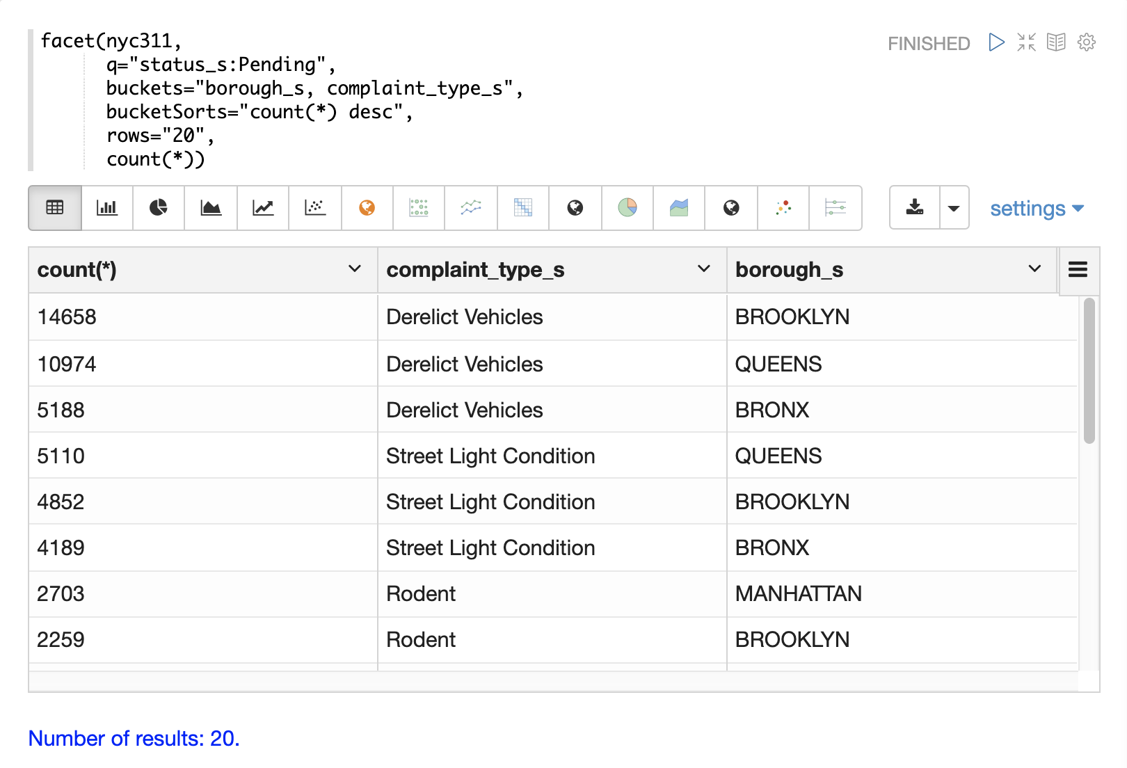
The next example demonstrates a multi-dimension aggregation.
Notice that the buckets parameter now contains two dimensions: borough_s and complaint_type_s.
This returns the top 20 combinations of borough and complaint type by count.
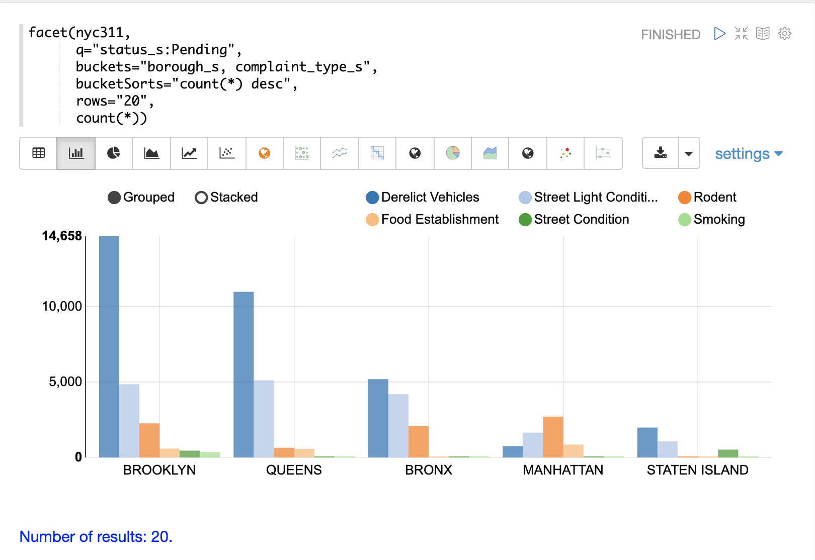
The example below shows the multi-dimension aggregation visualized as a grouped bar chart.
The facet function supports any combination of the following aggregate functions: count(*), sum, avg, min,
max.
facet2D
The facet2D function performs two dimensional aggregations that can be
visualized as heat maps or pivoted into matrices and operated on by machine learning functions.
facet2D has different syntax and behavior then a two dimensional facet function which
does not control the number of unique facets of each dimension. The facet2D function
has the dimensions parameter which controls the number of unique facets
for the x and y dimensions.
The example below visualizes the output of the facet2D function. In the example facet2D
returns the top 5 boroughs and the top 5 complaint types for each borough. The output is
then visualized as a heatmap.
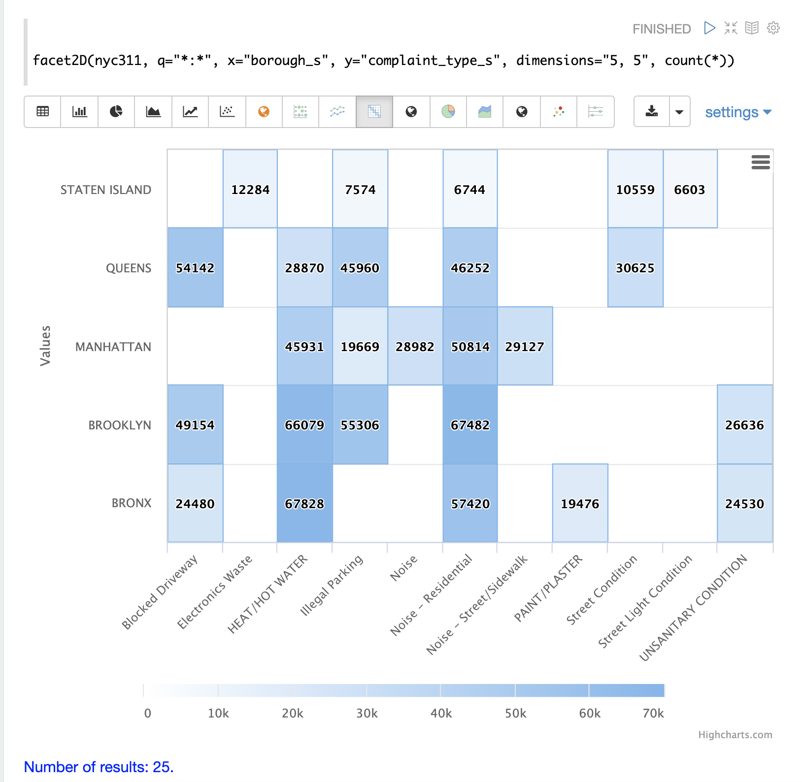
The facet2D function supports one of the following aggregate functions: count(*), sum, avg, min, max.
timeseries
The timeseries function performs fast, distributed time
series aggregation leveraging Solr’s builtin faceting and date math capabilities.
The example below performs a monthly time series aggregation over a collection of daily stock price data. In this example the average monthly closing price is calculated for the stock ticker amzn between a specific date range.
The output of the timeseries function is then visualized with a line chart.
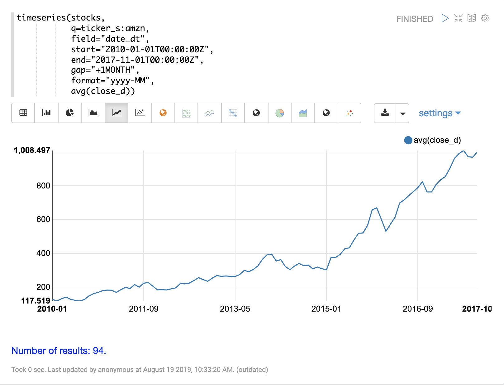
The timeseries function supports any combination of the following aggregate functions: count(*), sum, avg, min, max.
significantTerms
The significantTerms function queries a collection, but instead of returning documents, it returns significant terms found in documents in the result set.
This function scores terms based on how frequently they appear in the result set and how rarely they appear in the entire corpus.
The significantTerms function emits a tuple for each term which contains the term, the score, the foreground count and the background count.
The foreground count is how many documents the term appears in in the result set.
The background count is how many documents the term appears in in the entire corpus.
The foreground and background counts are global for the collection.
The significantTerms function can often provide insights that cannot be gleaned from other types of aggregations.
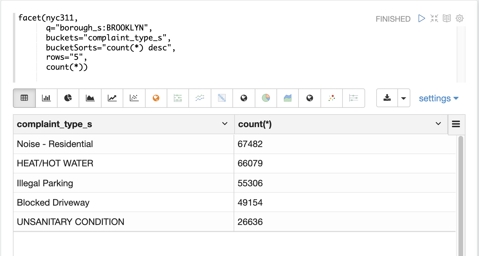
The example below illustrates the difference between the facet function and the significantTerms function.
In the first example the facet function aggregates the top 5 complaint types
in Brooklyn.
This returns the five most common complaint types in Brooklyn, but
its not clear that these terms appear more frequently in Brooklyn then
then the other boroughs.
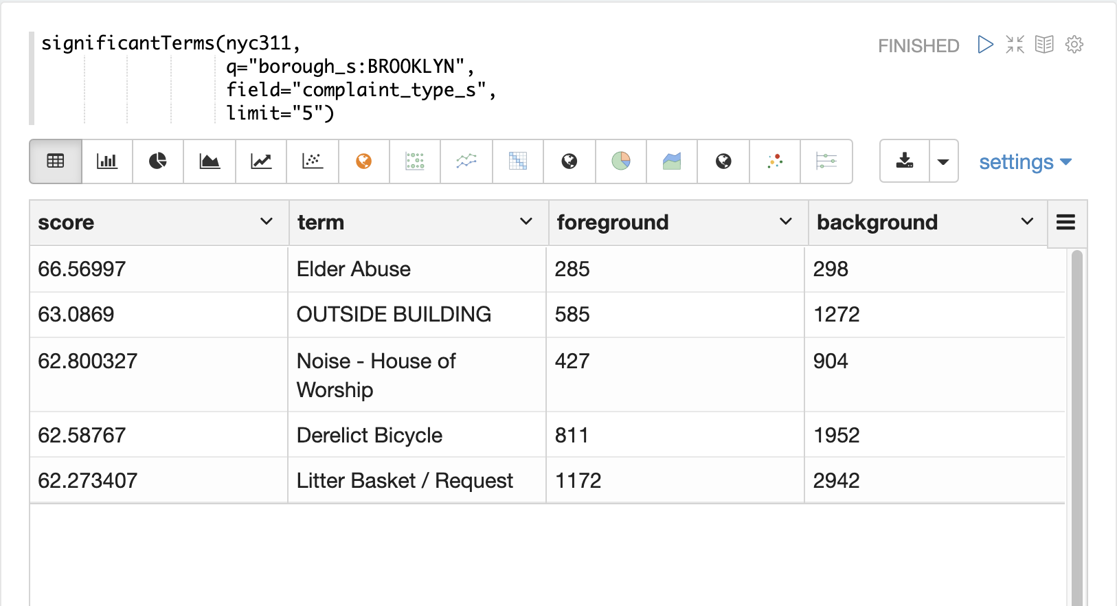
In the next example the significantTerms function returns the top 5 significant terms in the complaint_type_s field for the borough of Brooklyn.
The highest scoring term, Elder Abuse, has a foreground count of 285 and background count of 298.
This means that there were 298 Elder Abuse complaints in the entire data set, and 285 of them were in Brooklyn.
This shows that Elder Abuse complaints have a much higher occurrence rate in Brooklyn than the other boroughs.
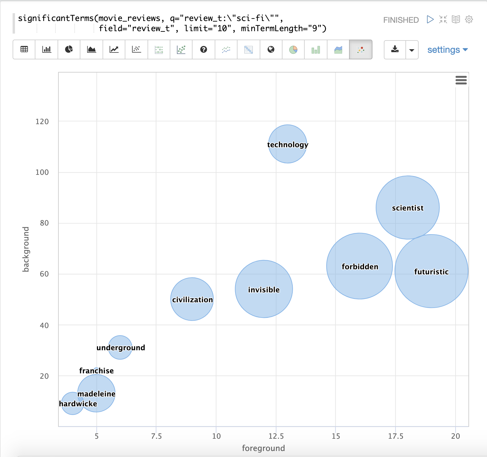
The final example shows a visualization of the significantTerms from a
text field containing movie reviews. The result shows the
significant terms that appear in movie reviews that have the phrase "sci-fi".
The results are visualized using a bubble chart with the foreground count on plotted on the x-axis and the background count on the y-axis. Each term is shown in a bubble sized by the score.
nodes
The nodes function performs aggregations of nodes during a breadth first search of a graph.
This function is covered in detail in the section Graph Traversal.
In this example the focus will be on finding correlated nodes in a time series
graph using the nodes expressions.
The example below finds stock tickers whose daily movements tend to be correlated with the ticker jpm (JP Morgan).
The inner search expression finds records between a specific date range
where the ticker symbol is jpm and the change_d field (daily change in stock price) is greater then .25.
This search returns all fields in the index including the yearMonthDay_s which is the string representation of the year, month, and day of the matching records.
The nodes function wraps the search function and operates over its results. The walk parameter maps a field from the search results to a field in the index.
In this case the yearMonthDay_s is mapped back to the yearMonthDay_s field in the same index.
This will find records that have same yearMonthDay_s field value returned
by the initial search, and will return records for all tickers on those days.
A filter query is applied to the search to filter the search to rows that have a change_d
greater the .25.
This will find all records on the matching days that have a daily change greater then .25.
The gather parameter tells the nodes expression to gather the ticker_s symbols during the breadth first search.
The count(*) parameter counts the occurrences of the tickers.
This will count the number of times each ticker appears in the breadth first search.
Finally the top function selects the top 5 tickers by count and returns them.
The result below shows the ticker symbols in the nodes field and the counts for each node.
Notice jpm is first, which shows how many days jpm had a change greater then .25 in this time
period.
The next set of ticker symbols (mtb, slvb, gs and pnc) are the symbols with highest number of days with a change greater then .25 on the same days that jpm had a change greater then .25.
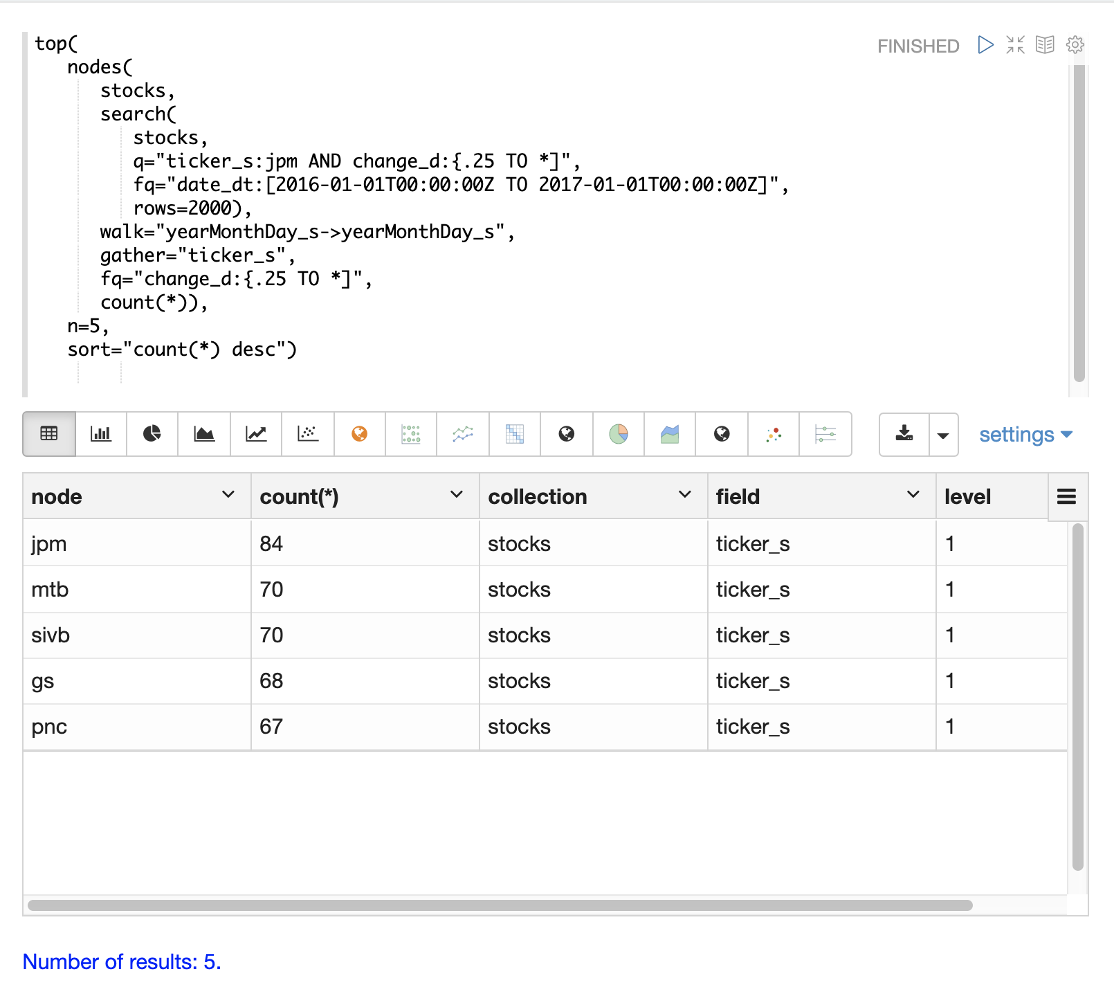
The nodes function supports any combination of the following aggregate functions: count(*), sum, avg, min, max.